Whole Foods Market Rebrand
Context
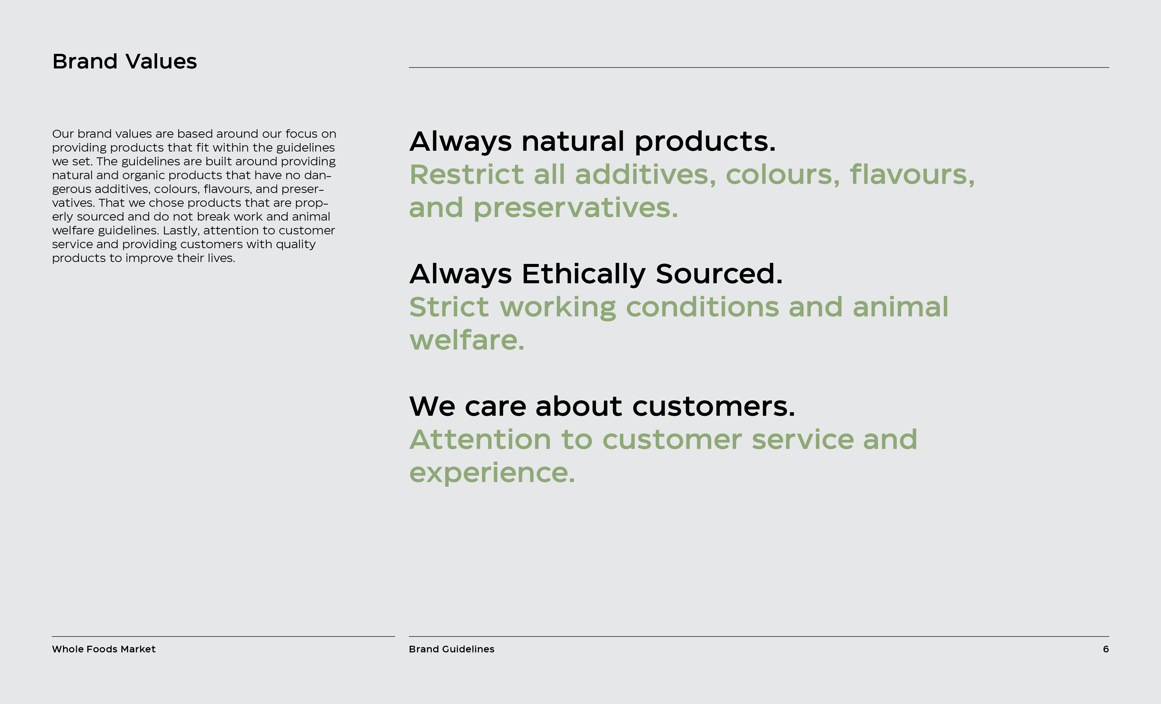
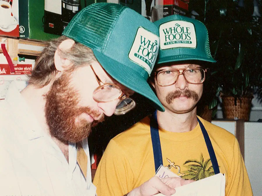
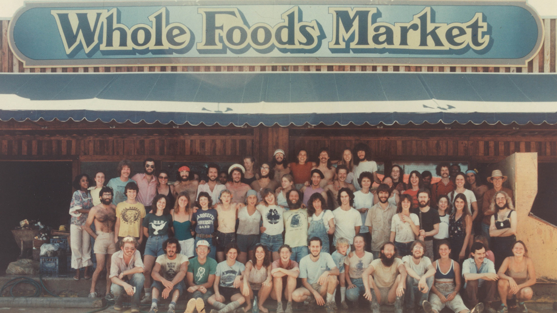
Whole Foods Market, is an international health food supermarket specializing in products that are natural, and organic, and fulfill a variety of diets. It is important to the brand that all products that are sold are properly sourced, does not break work and animal welfare guidelines, and are free of dangerous additives and preservatives.

Method
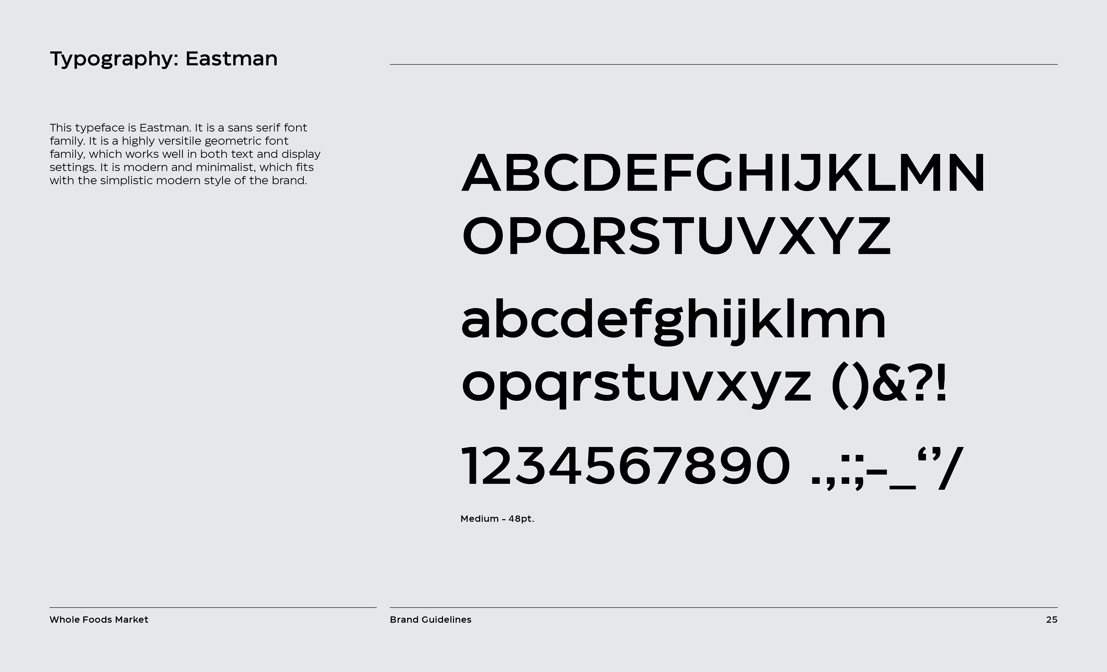
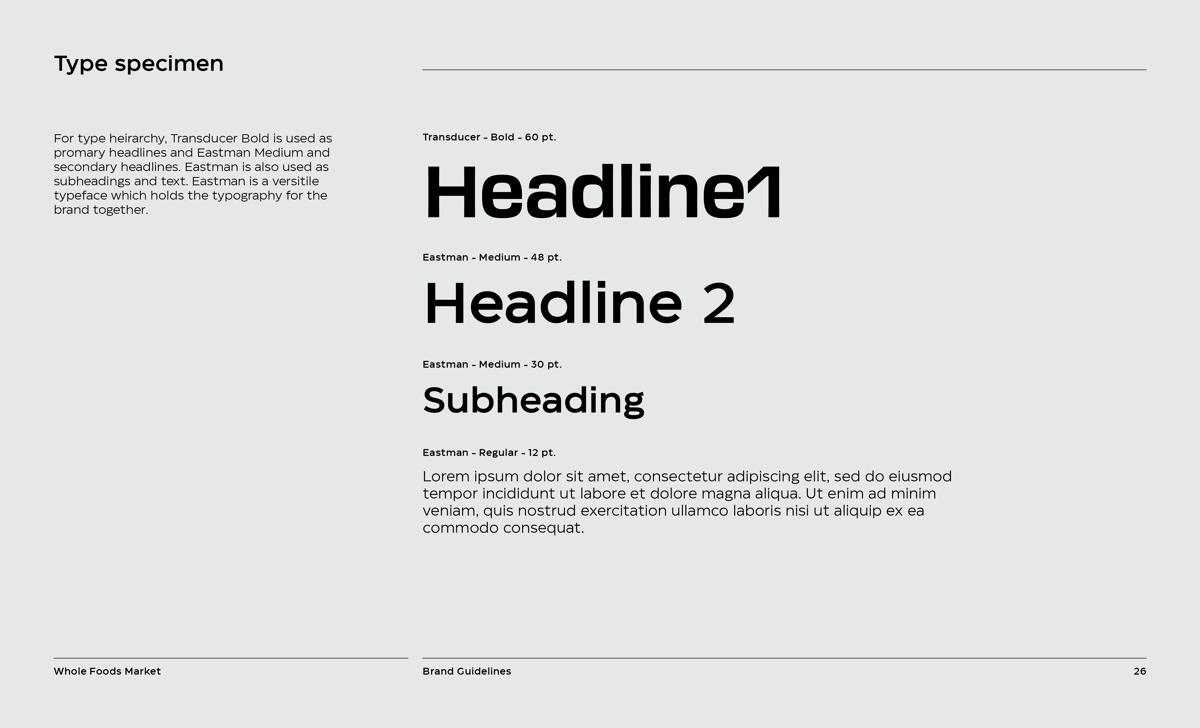
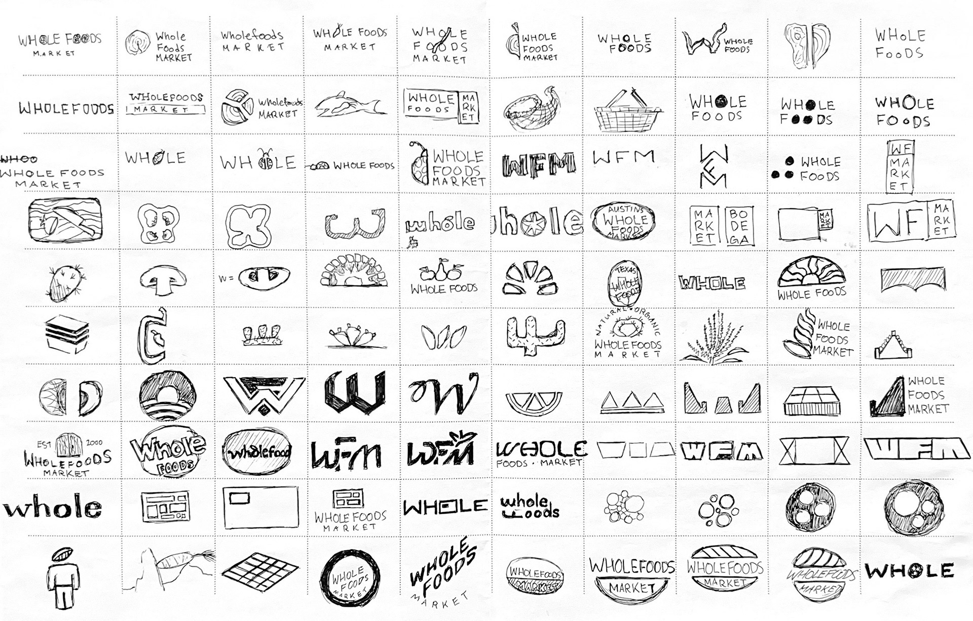
This is a rebranding project, to create a creative and mature solution for an existing brand. The goal is to make a thorough visual identity for the brand consisting of branding, a campaign, and a graphics standard manual. The manual contains content like; brand values and characteristics, logo information, typography, and photography styles.
Solution
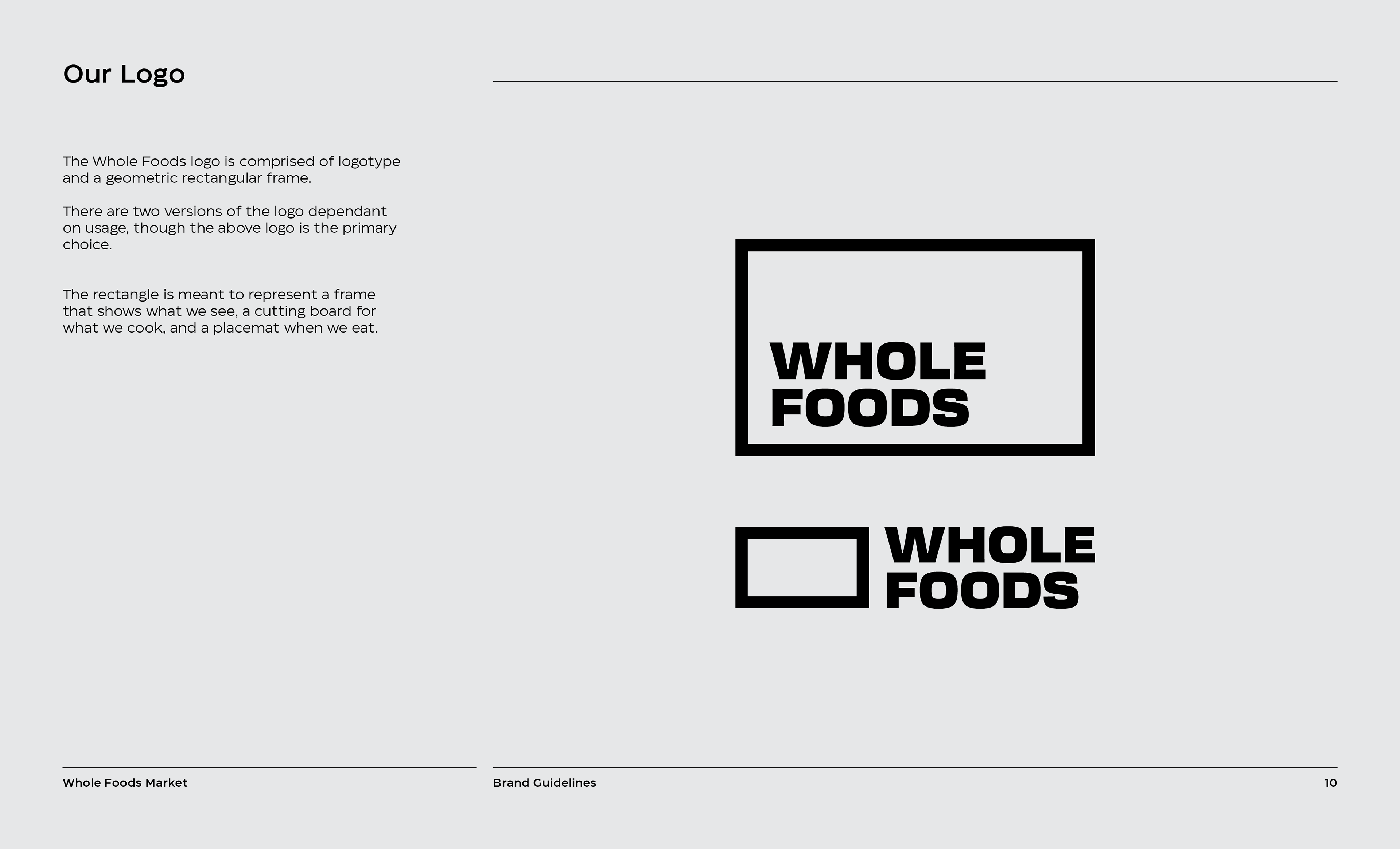
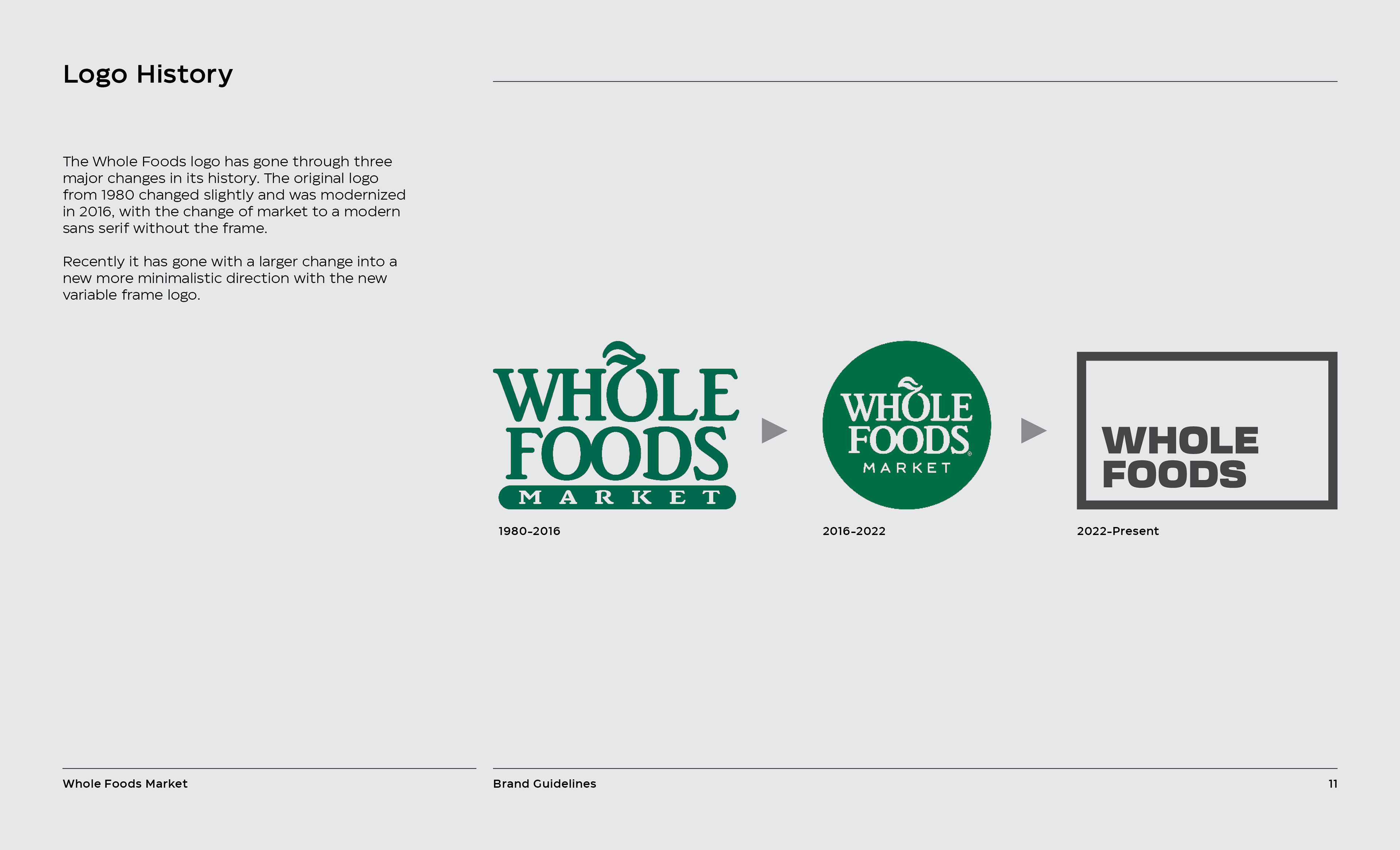
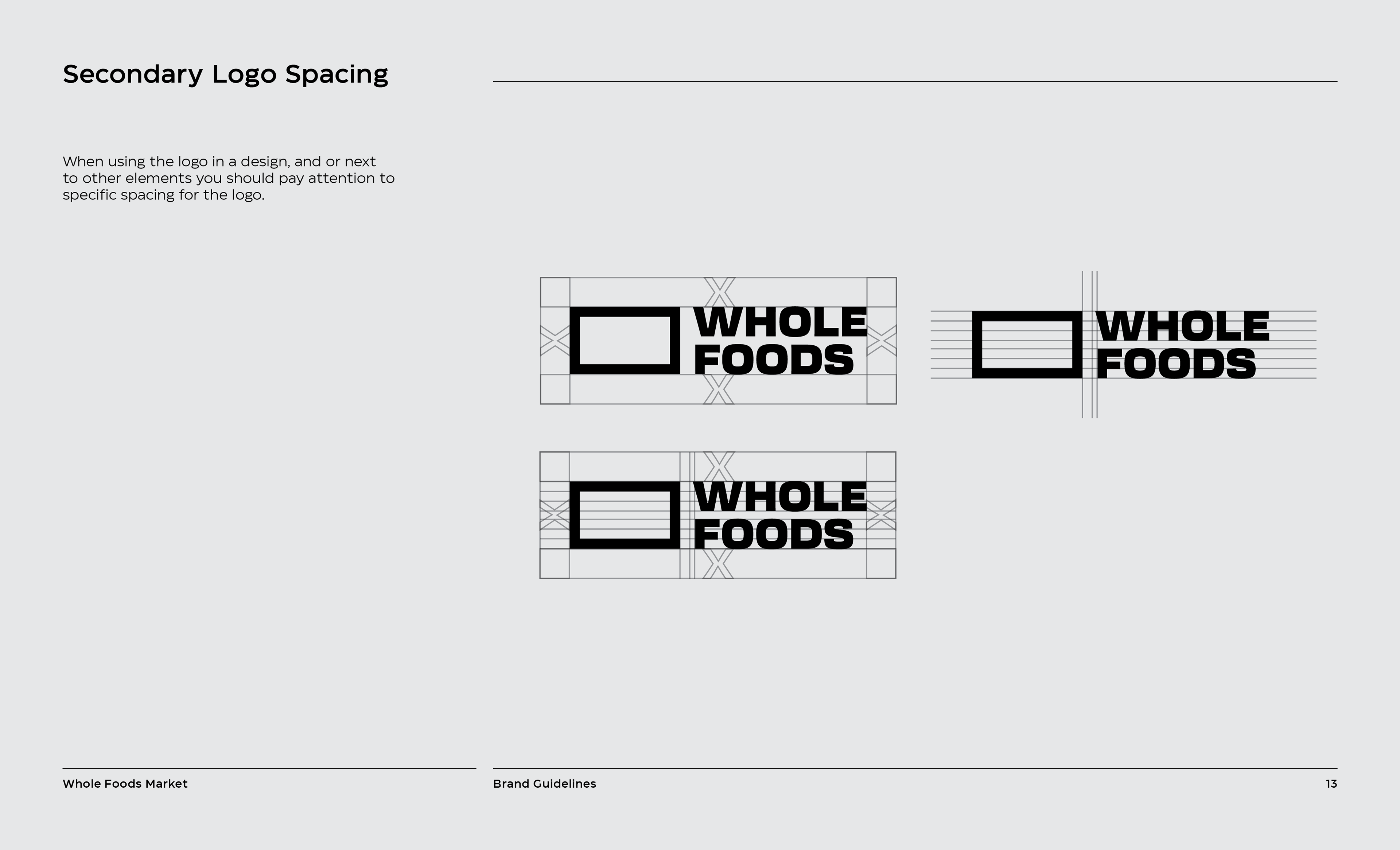
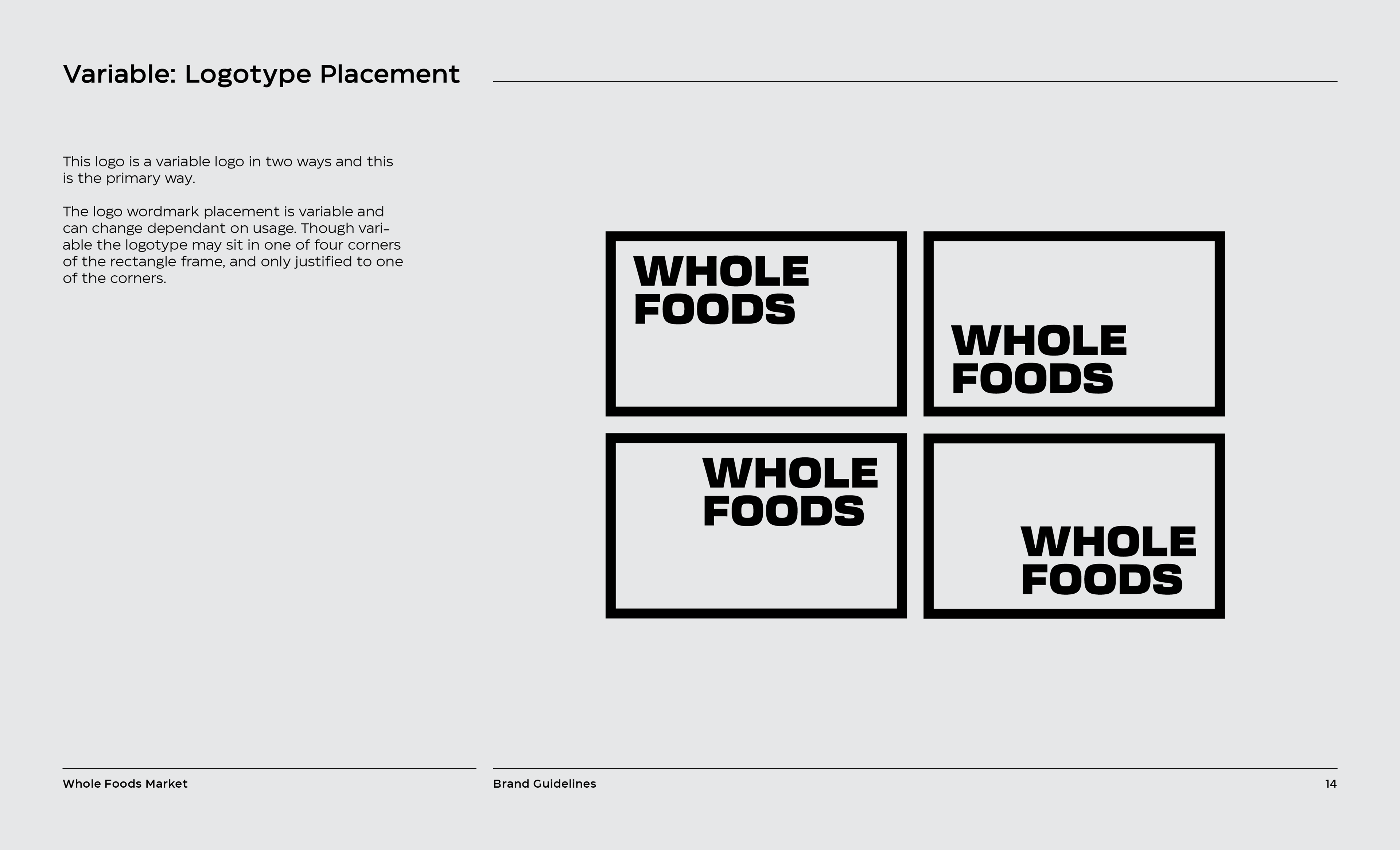
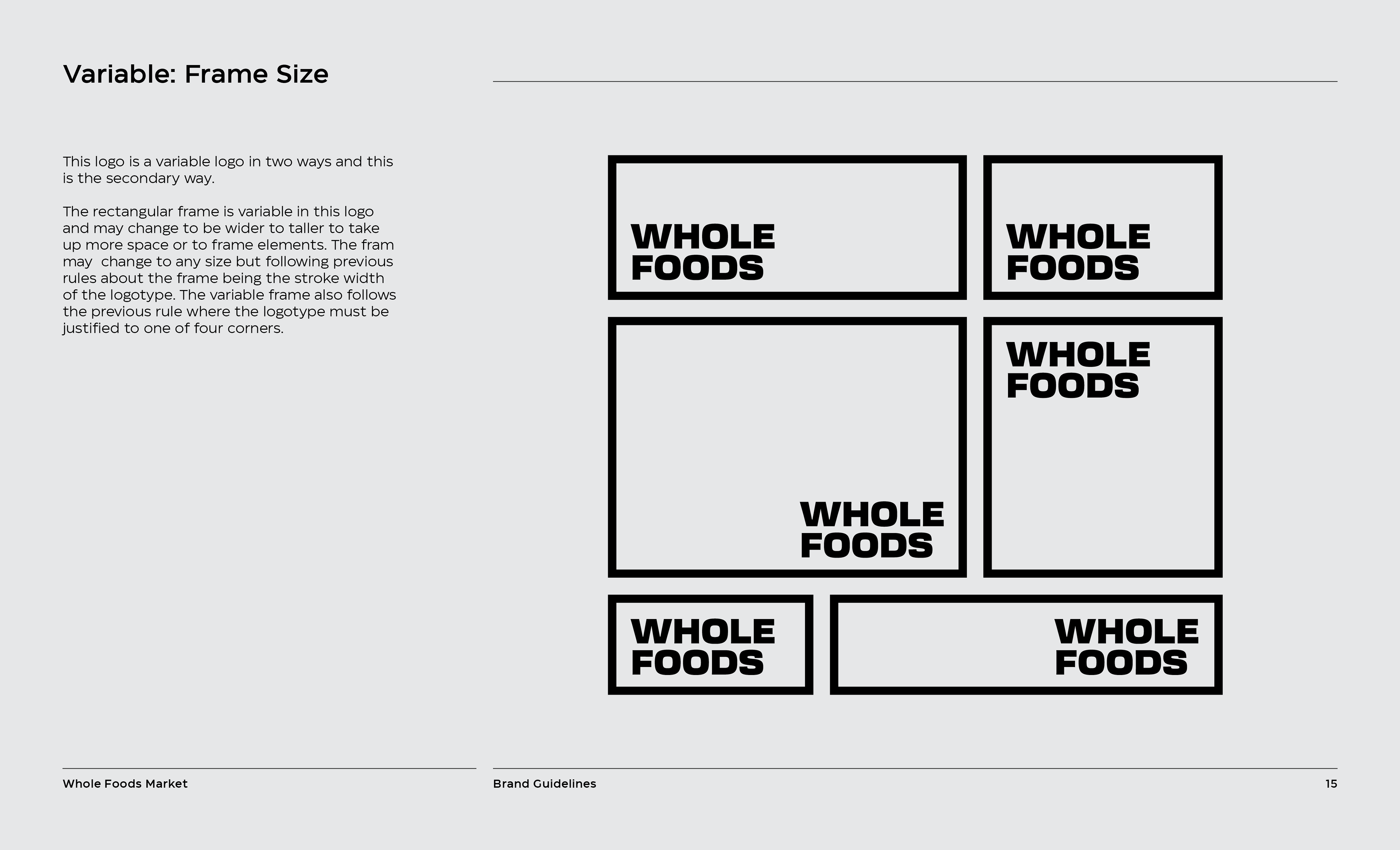
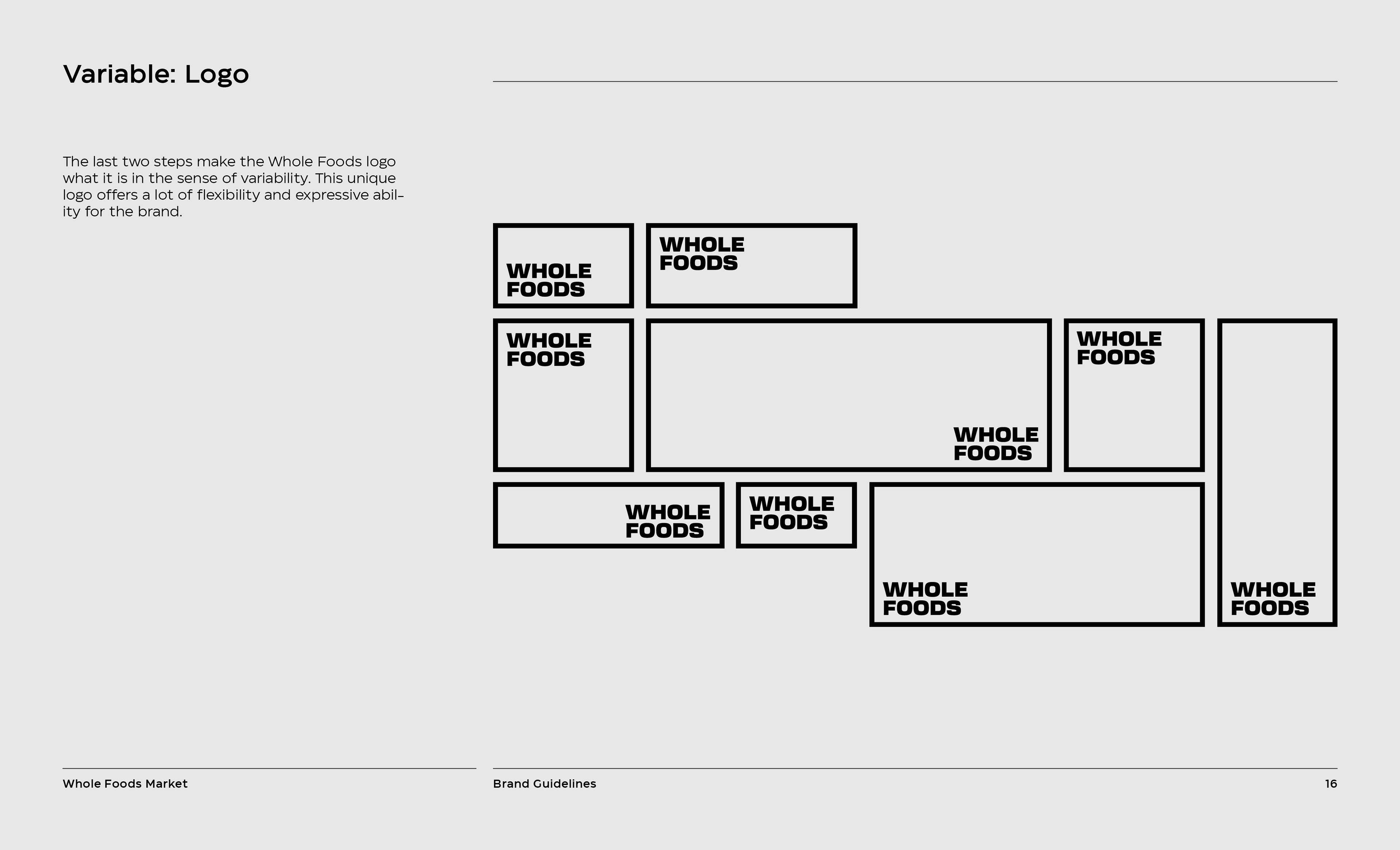
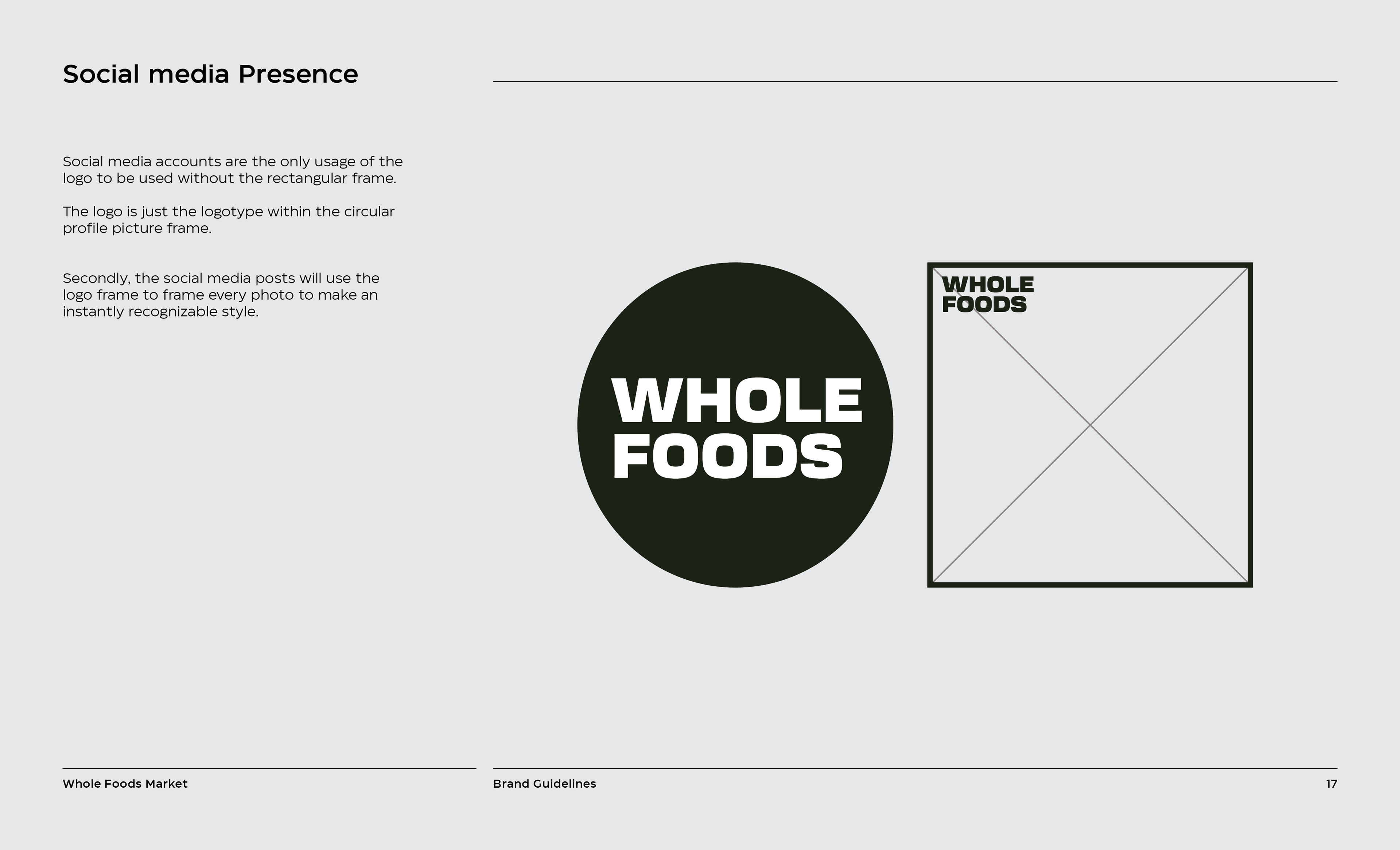
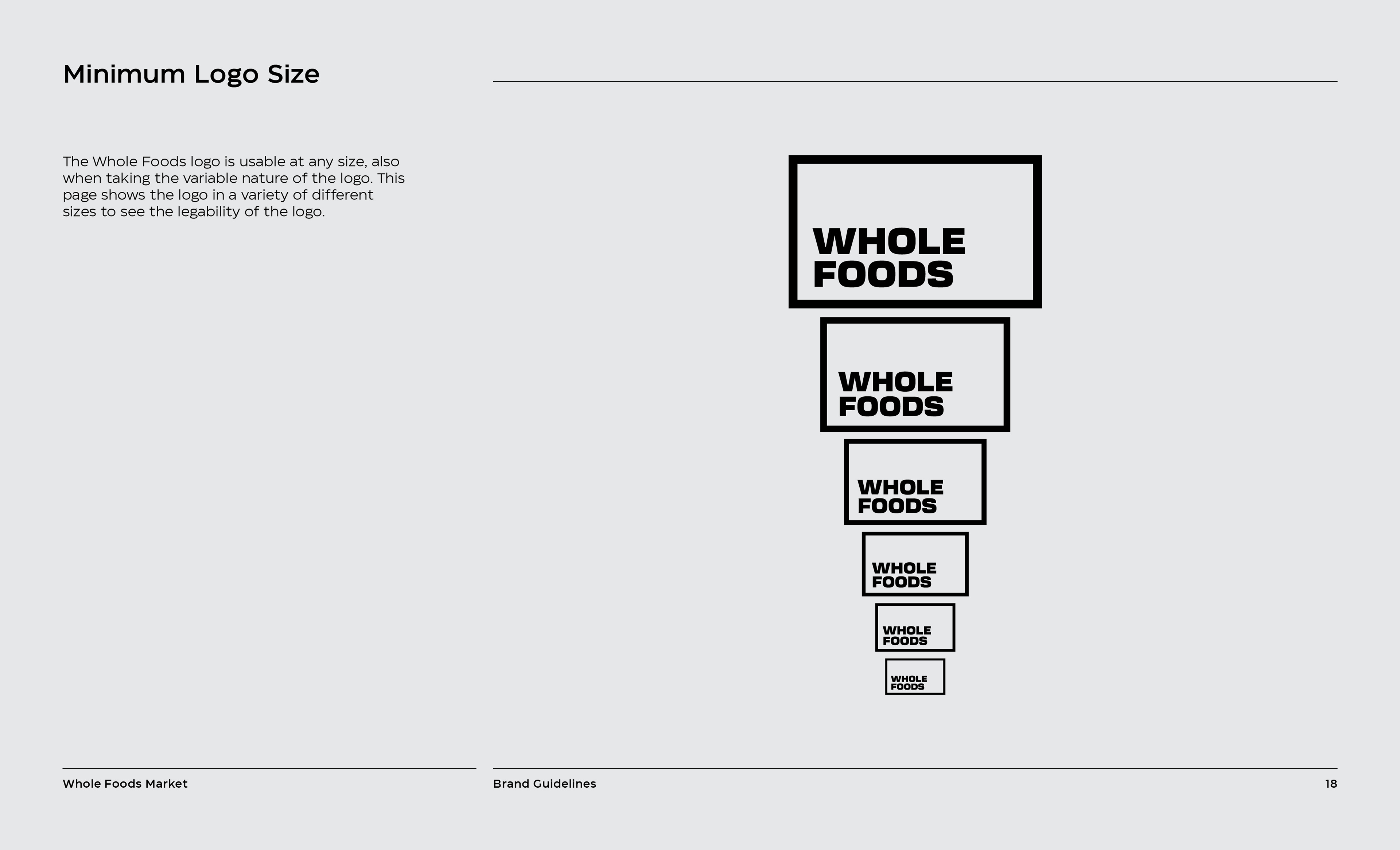
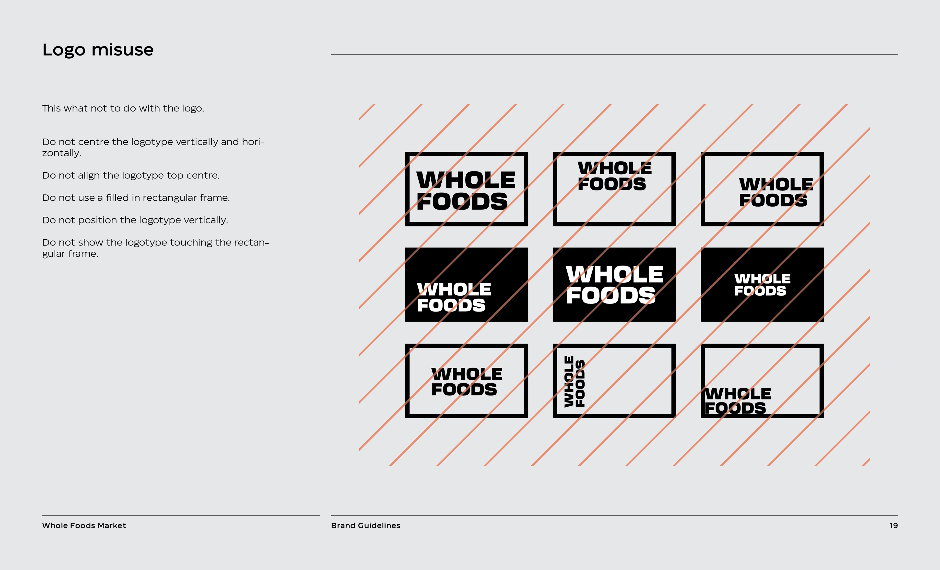
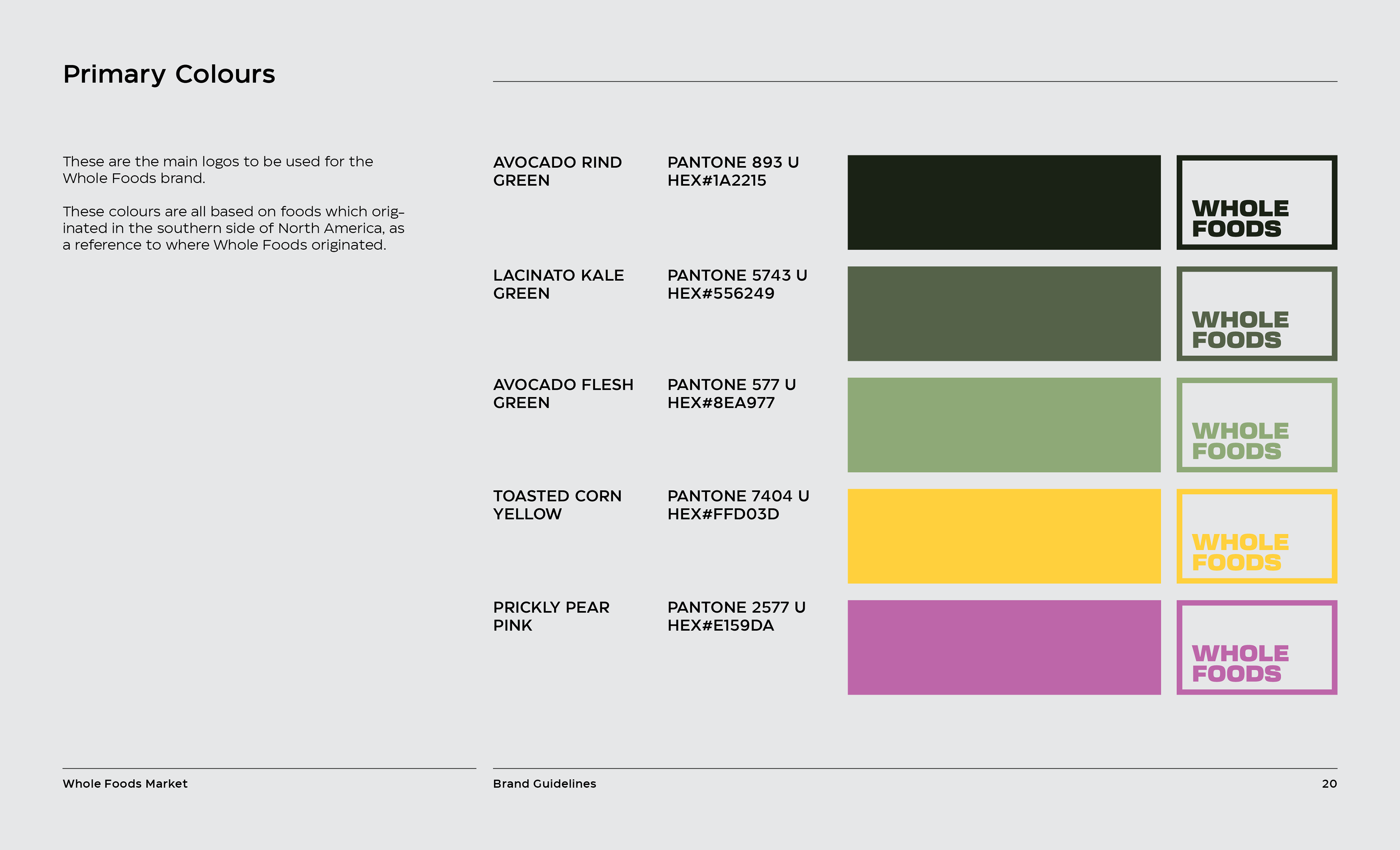
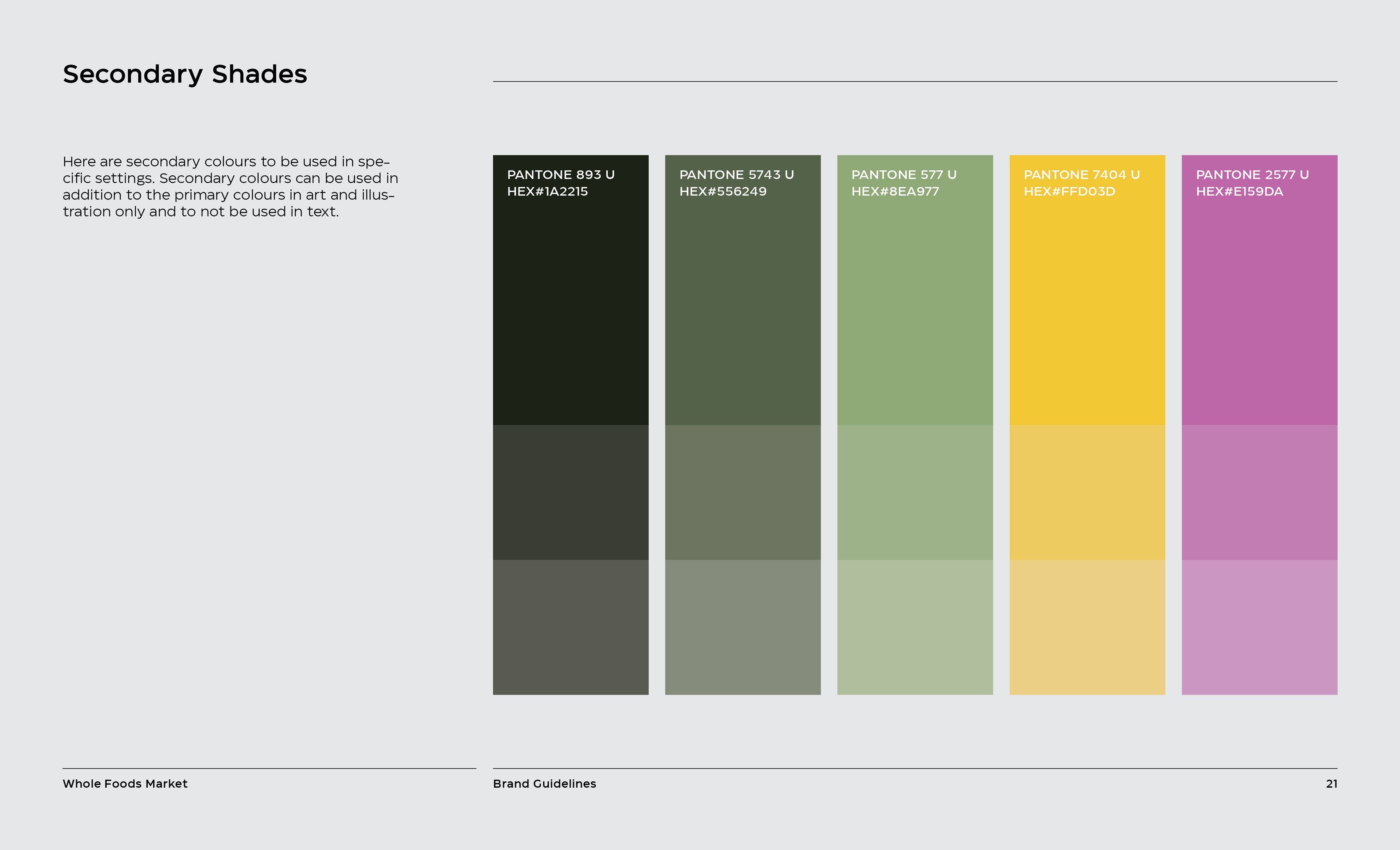
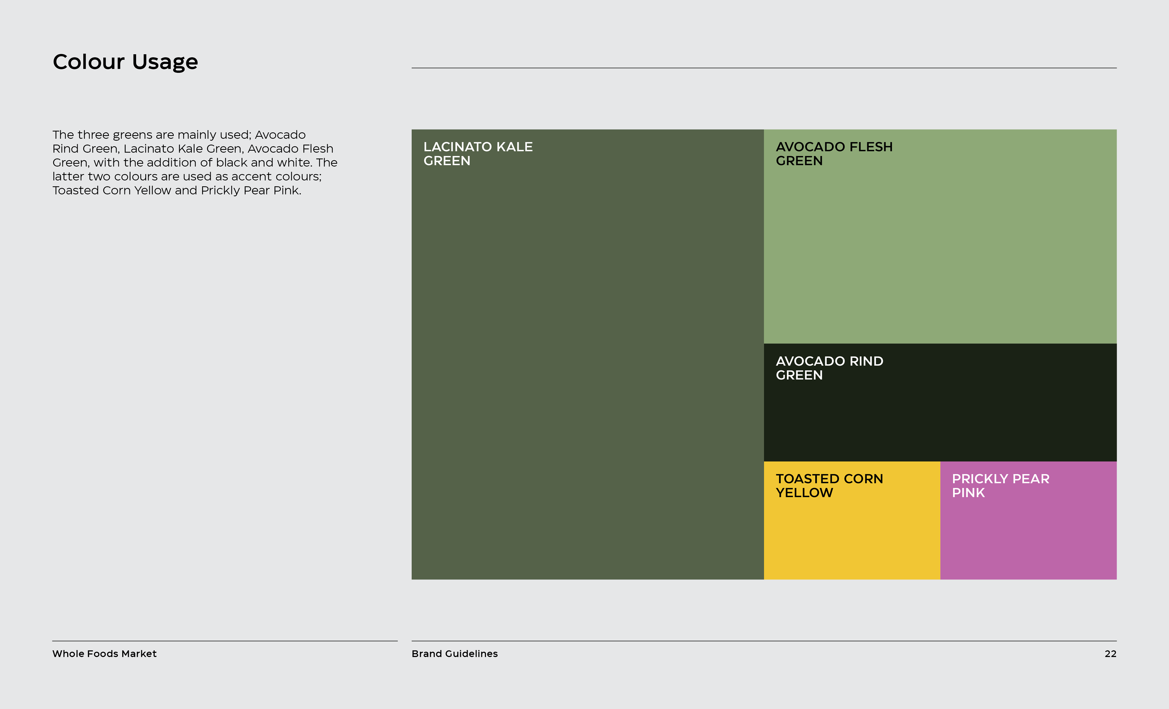
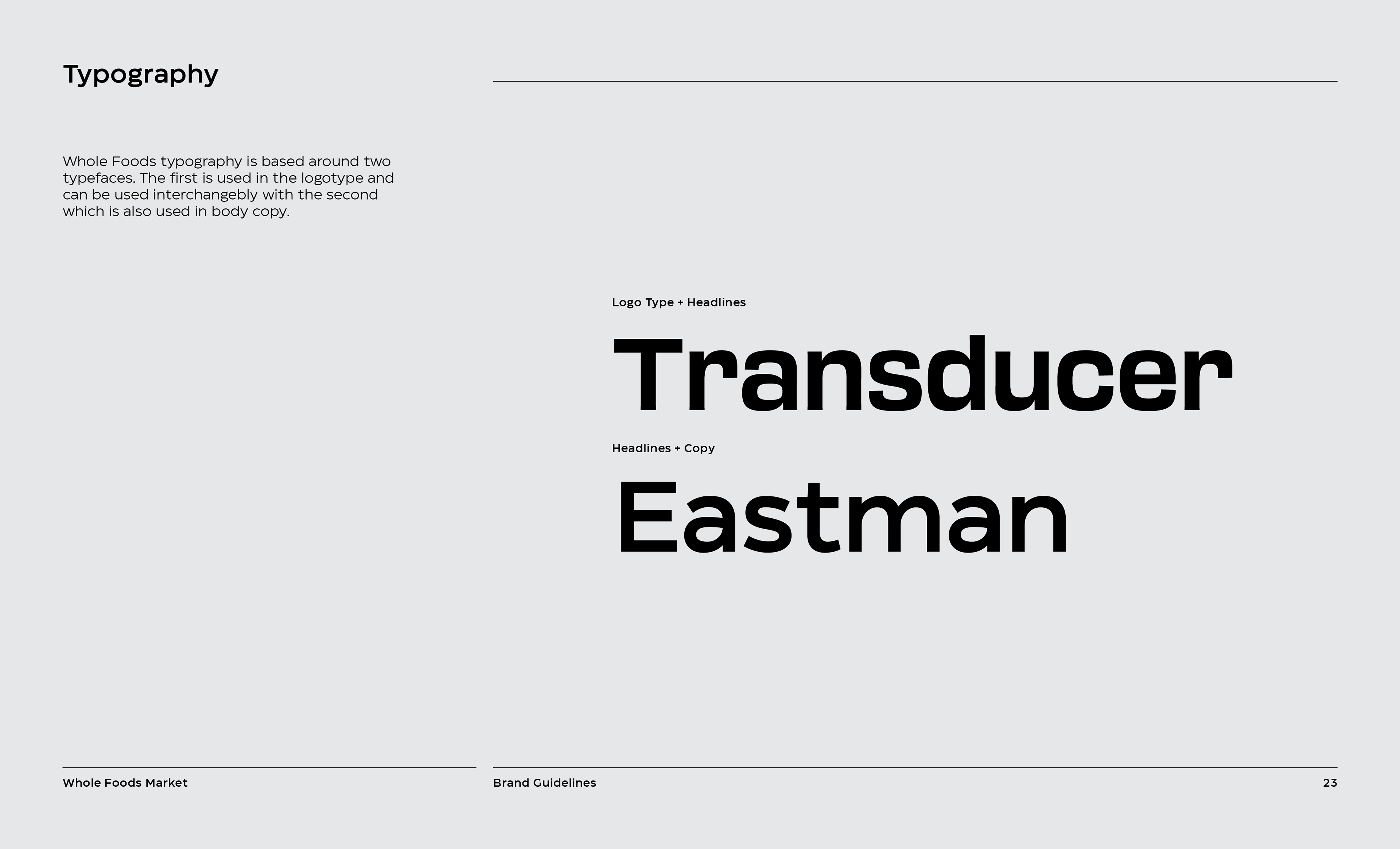
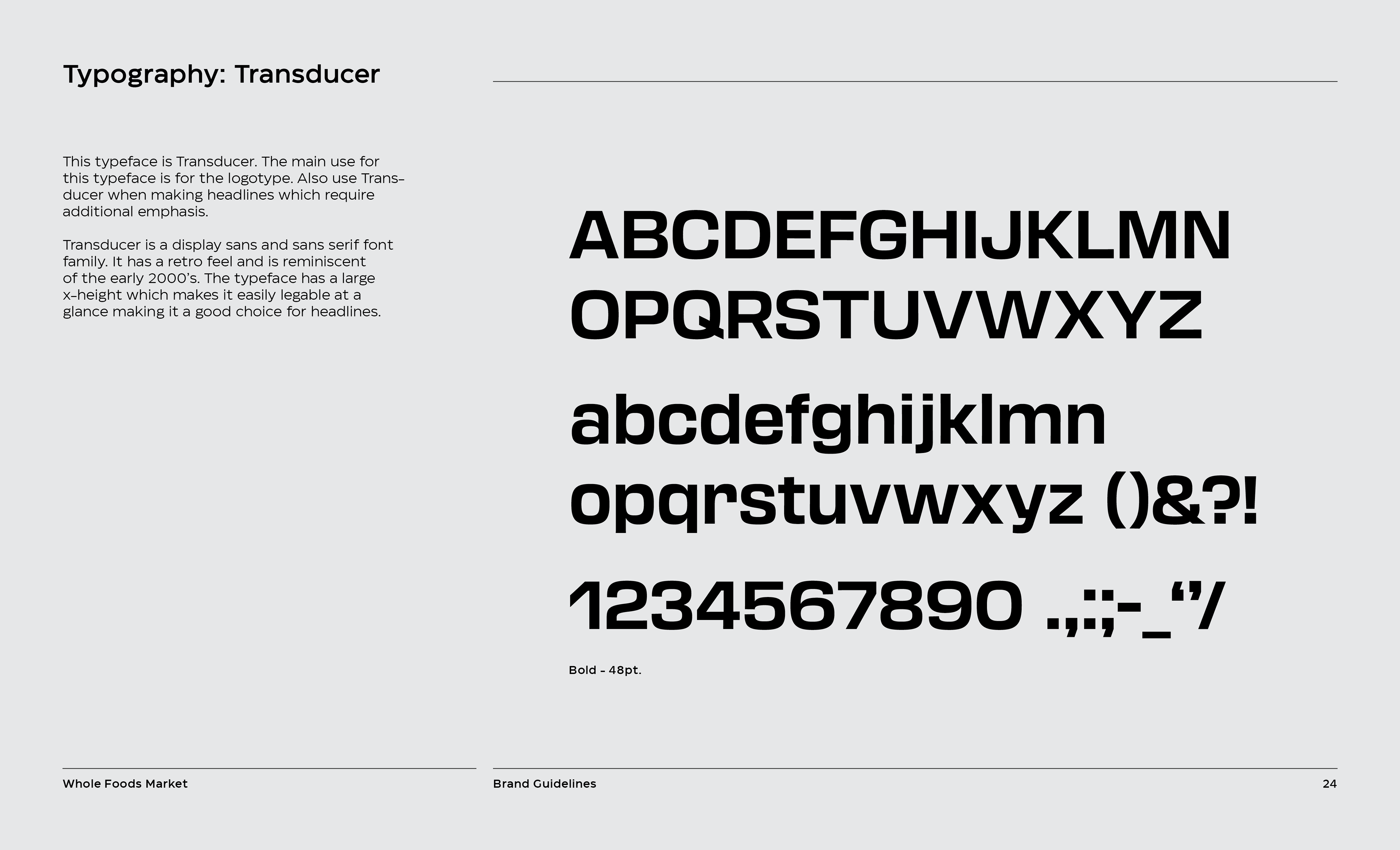
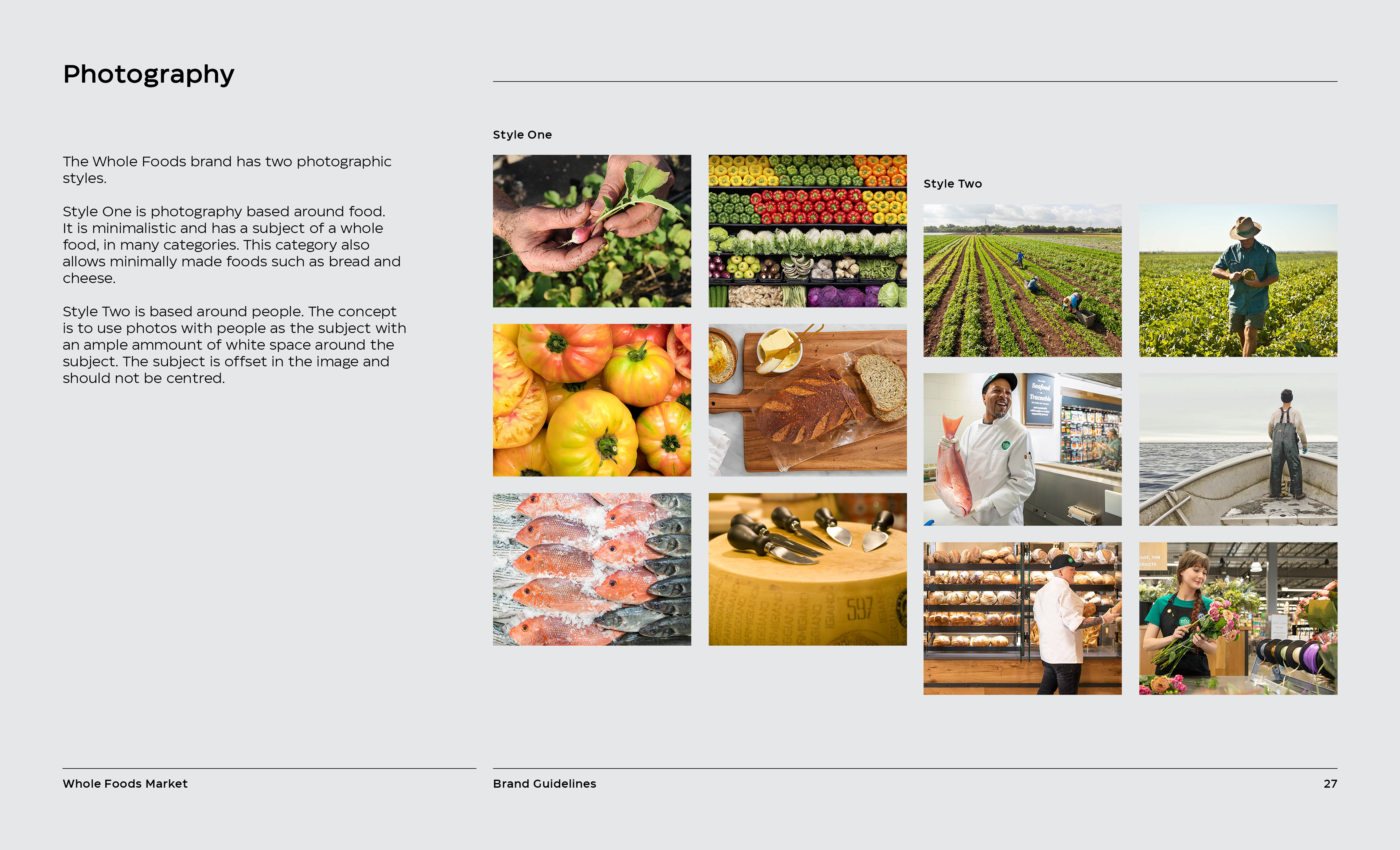
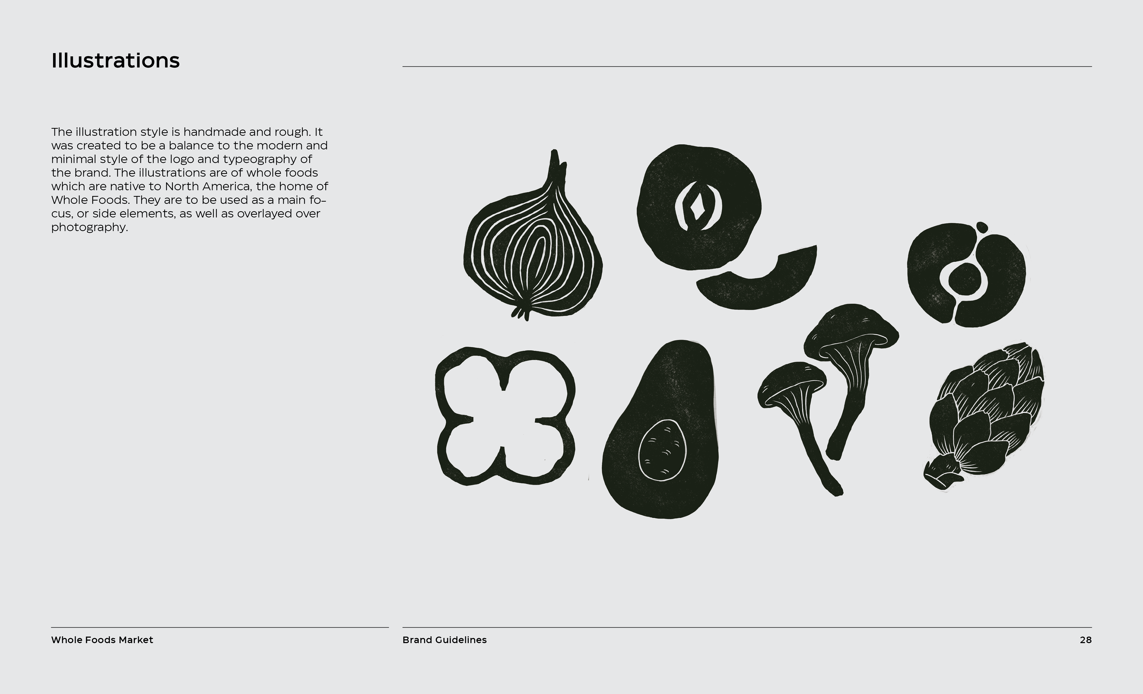
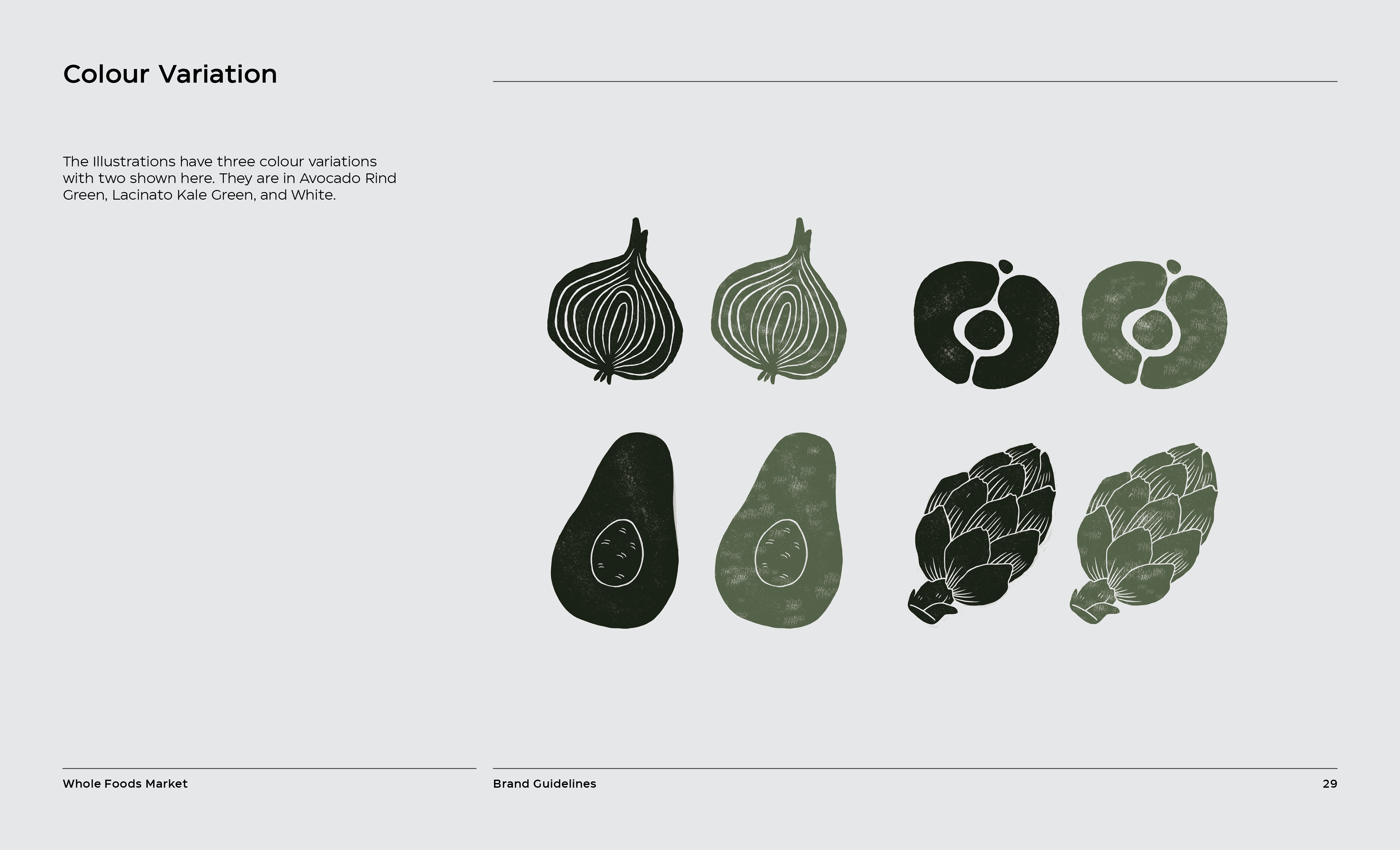
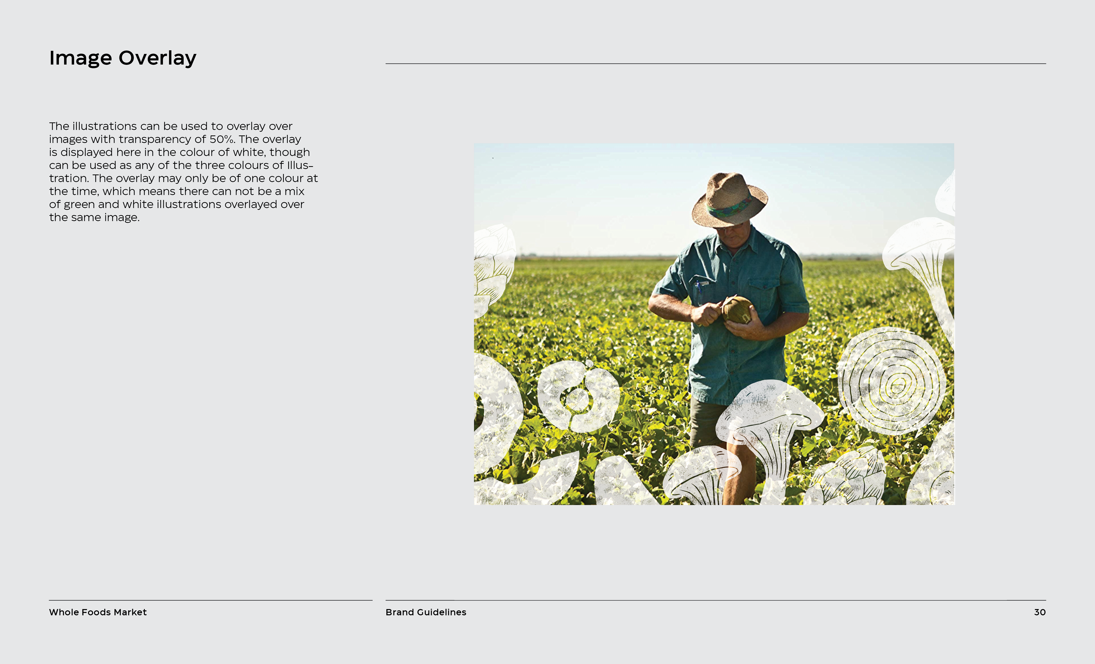
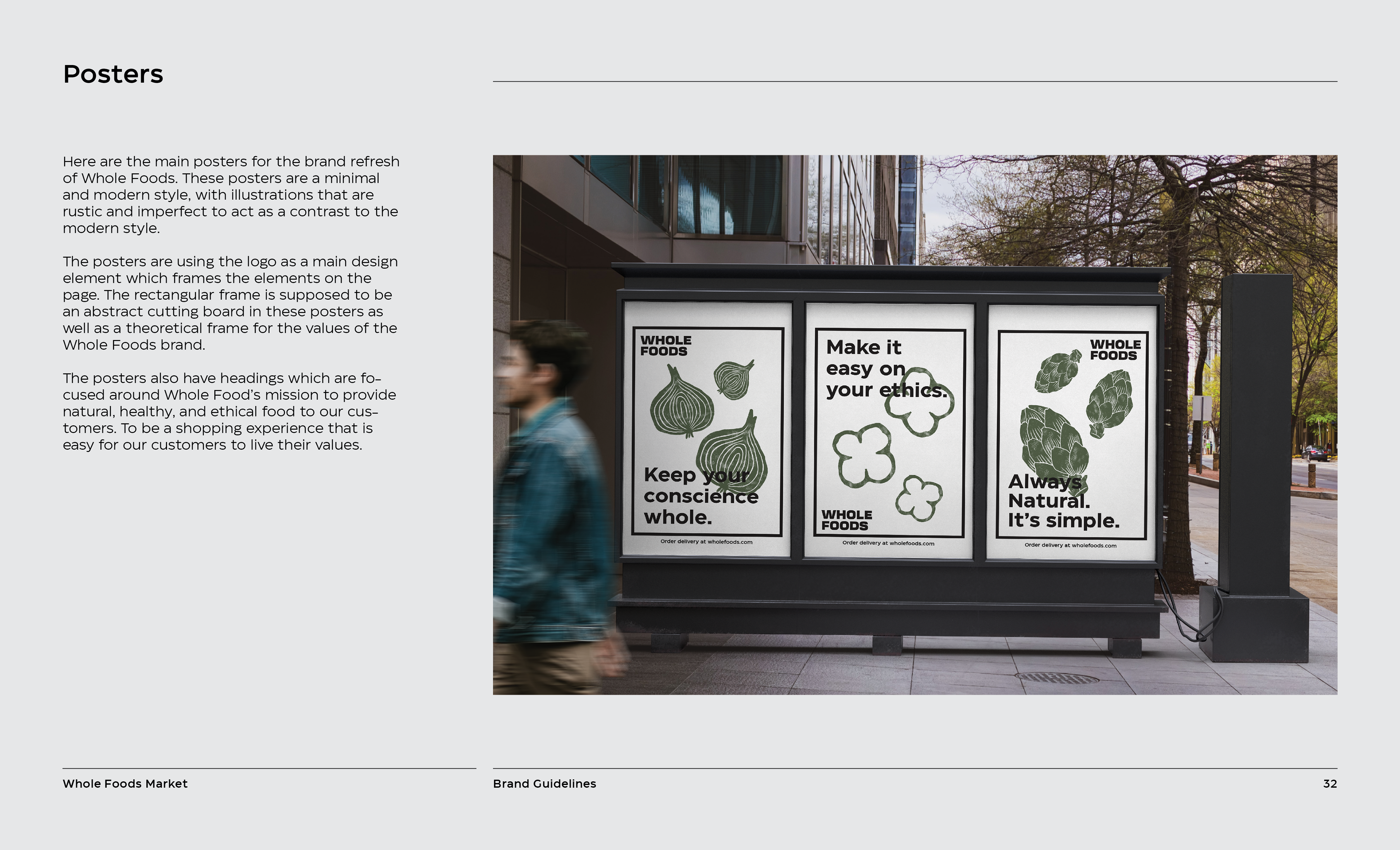
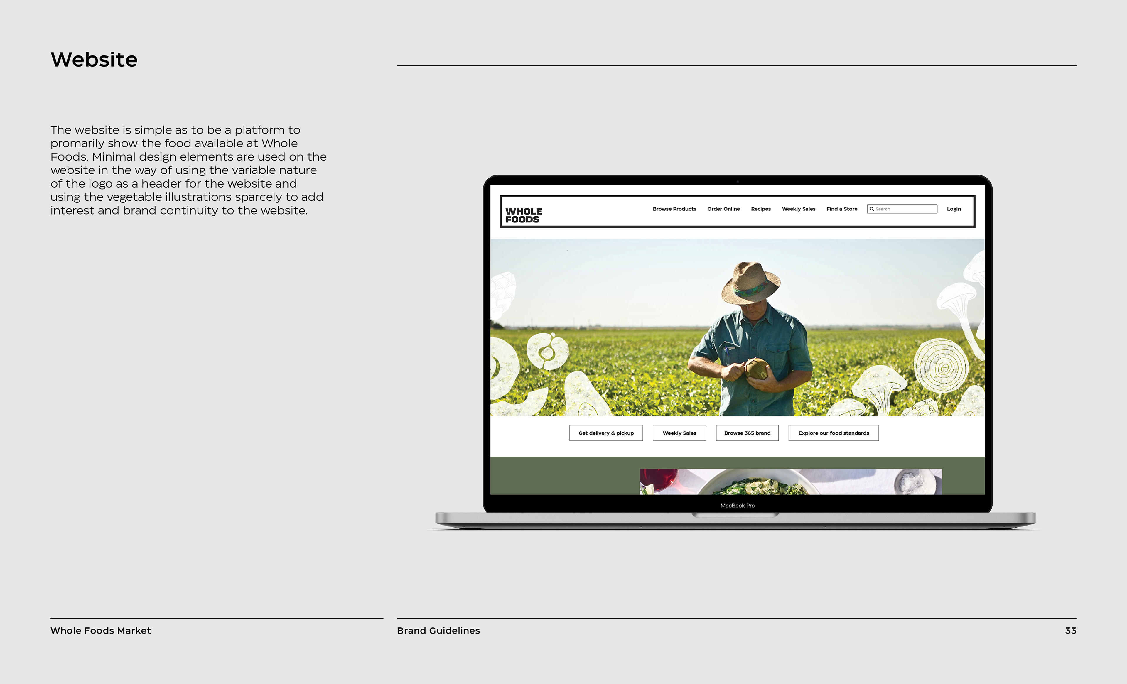
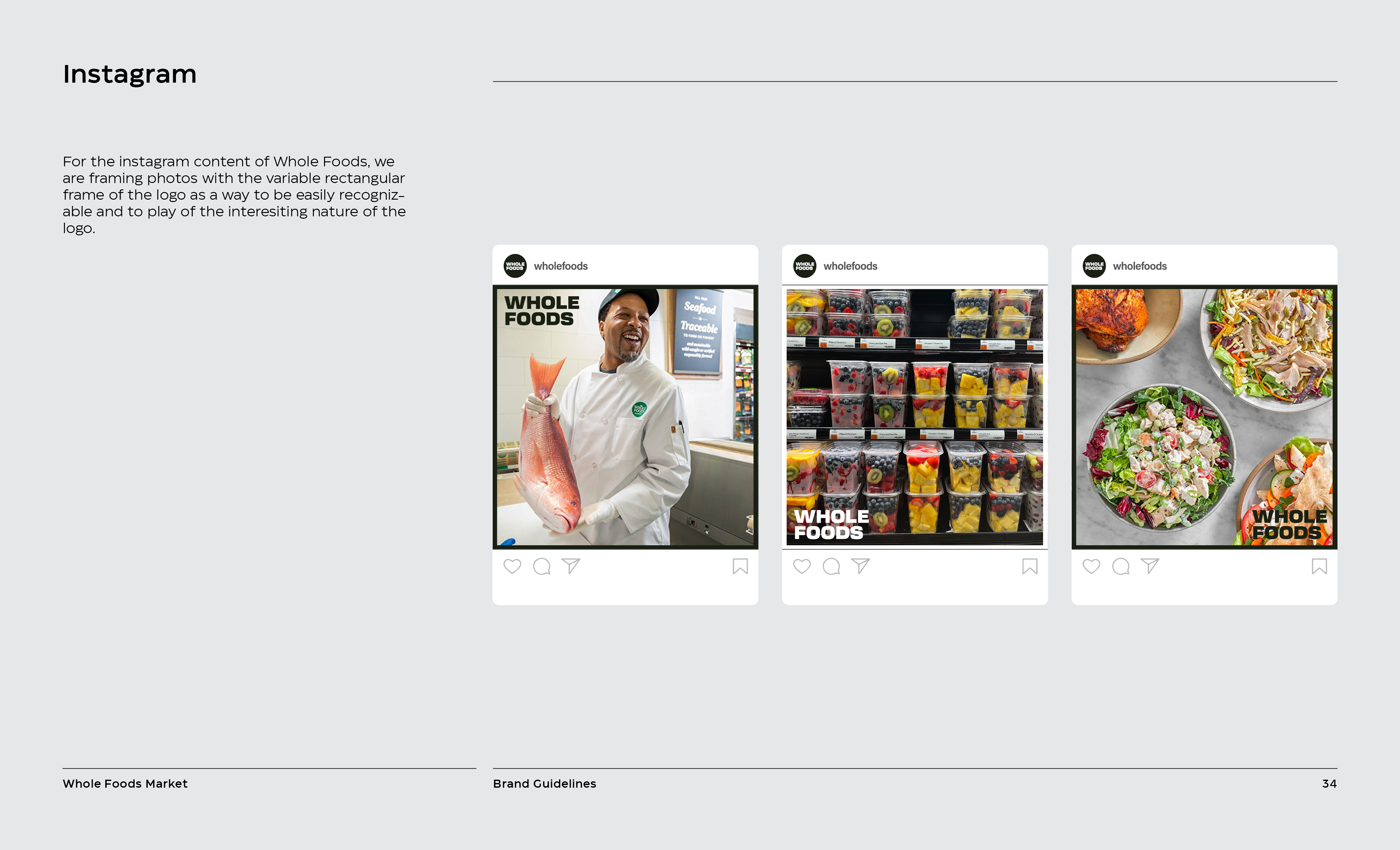
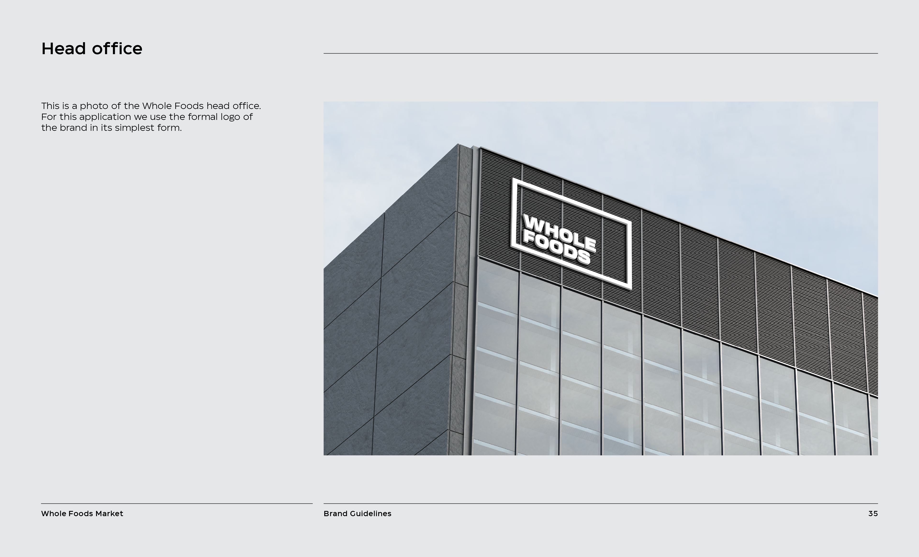
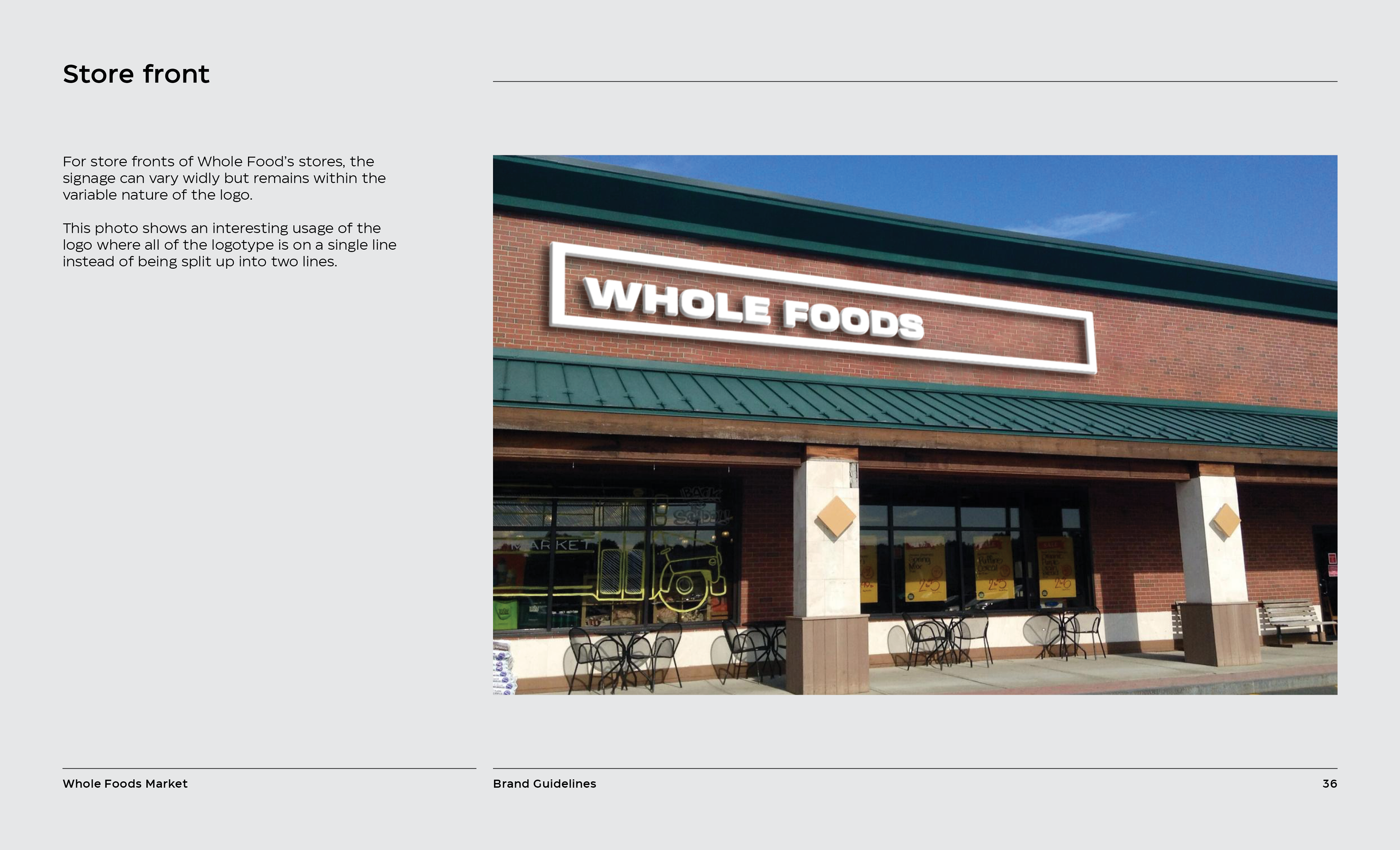
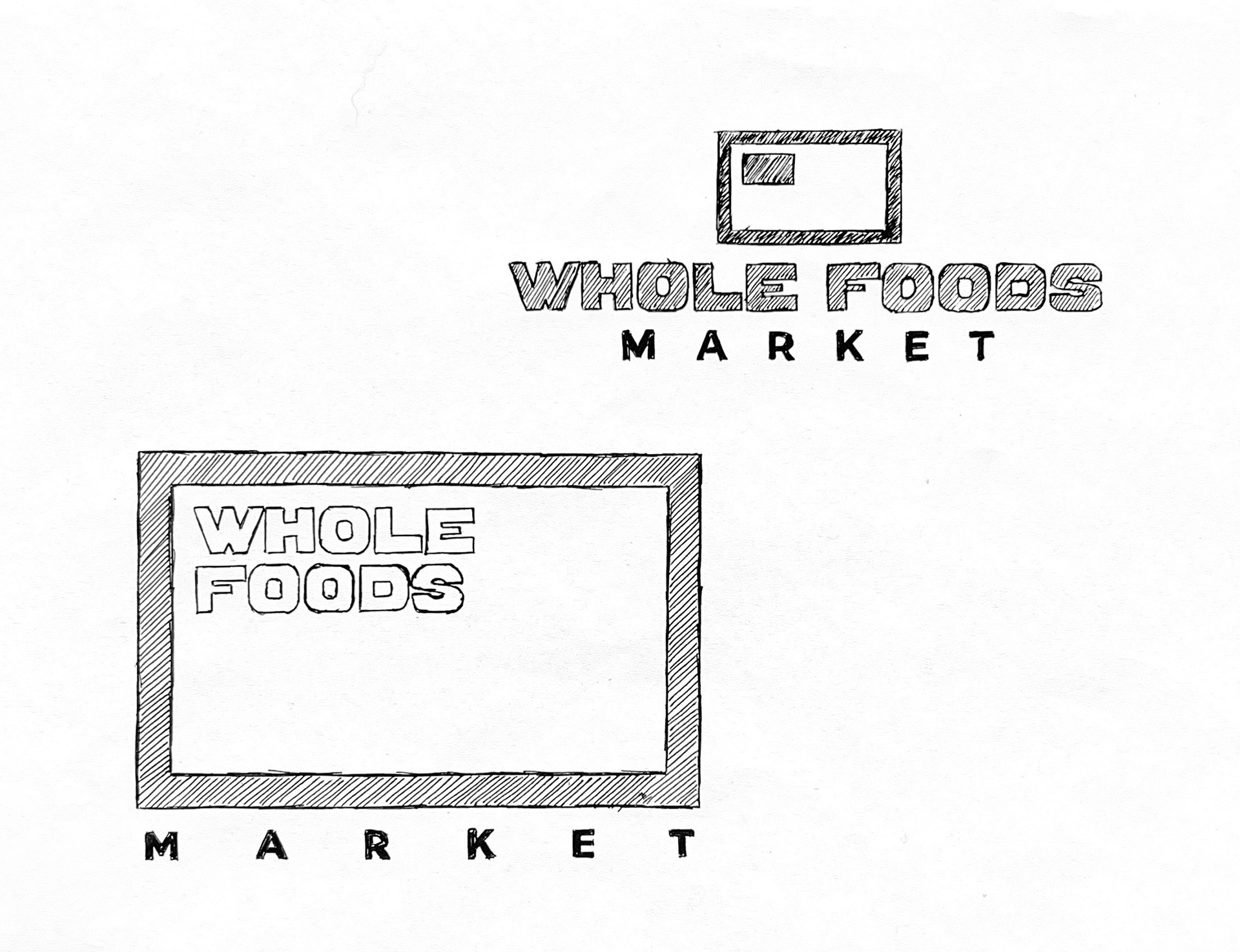
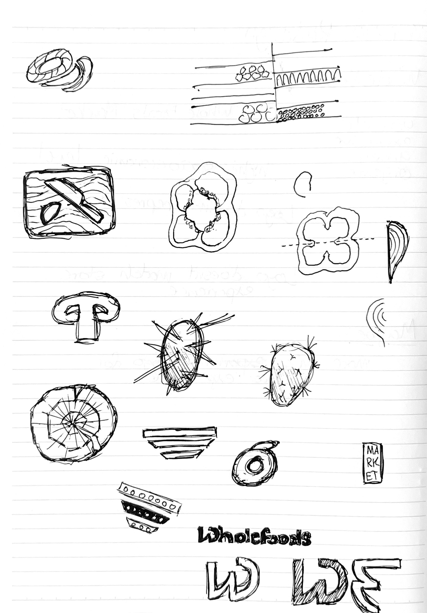
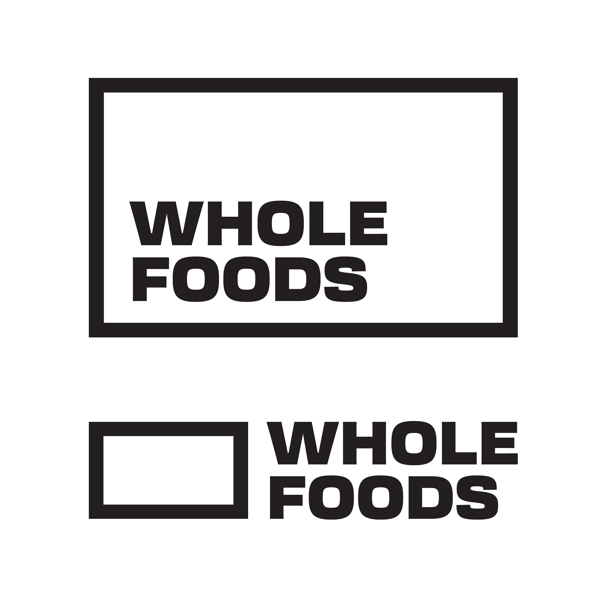
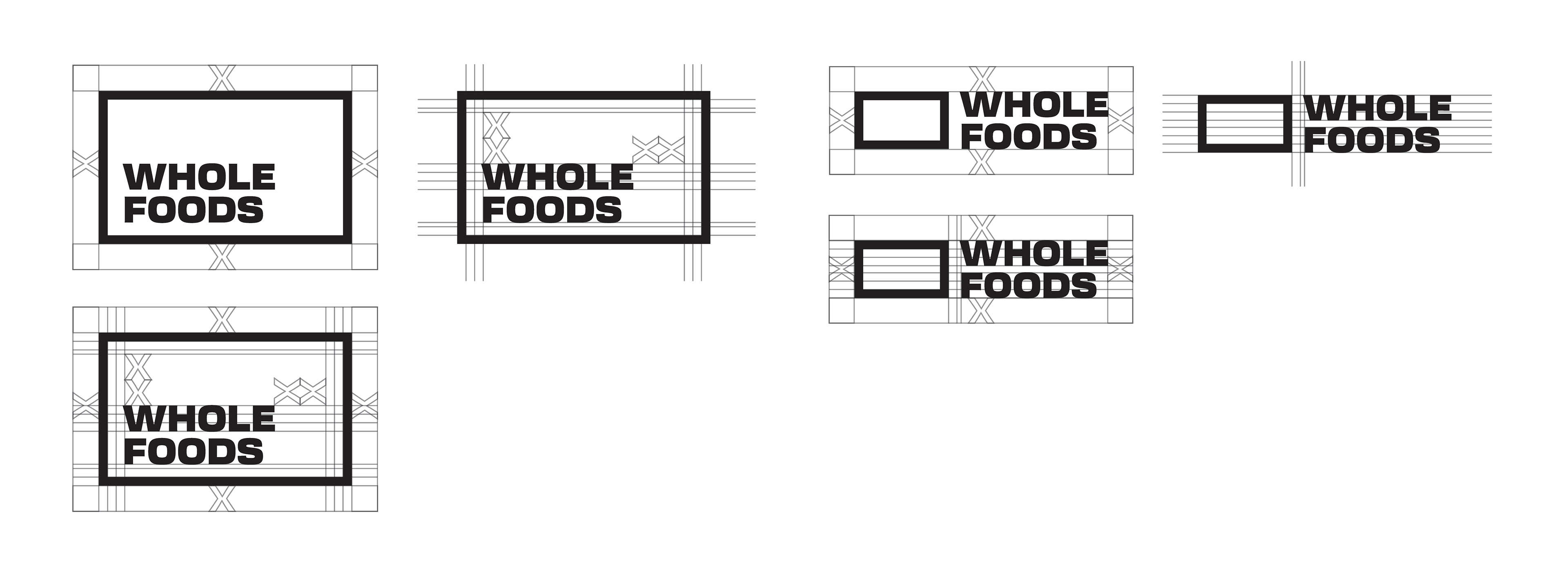
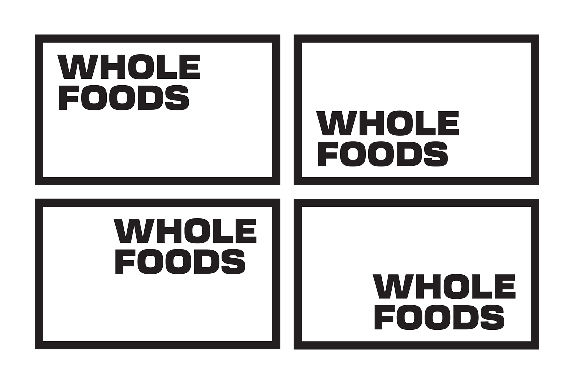
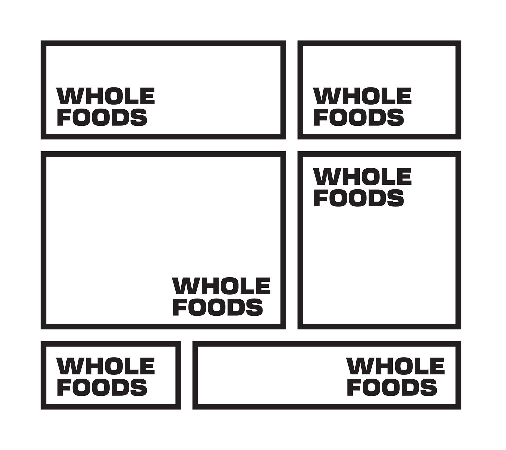
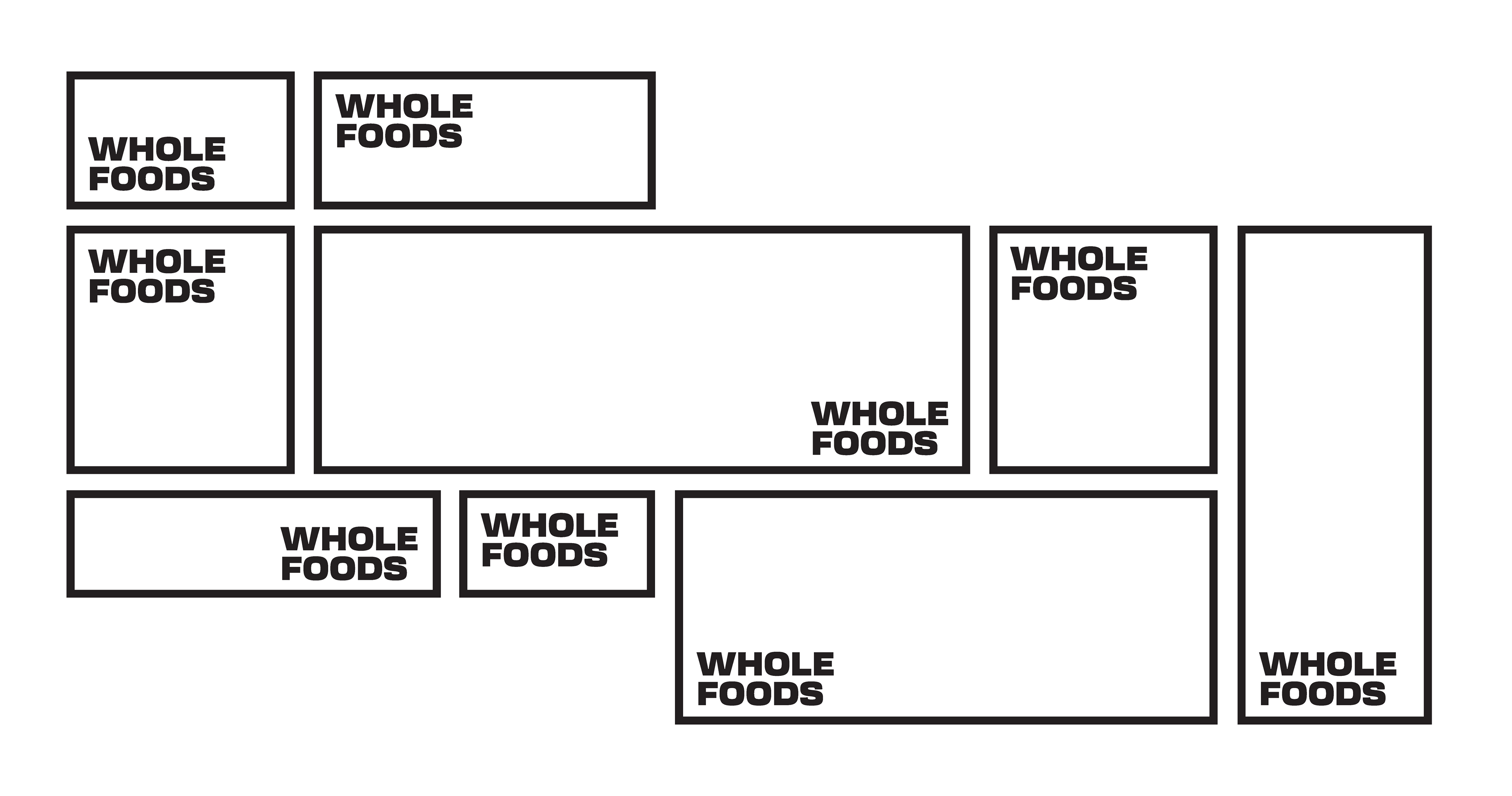
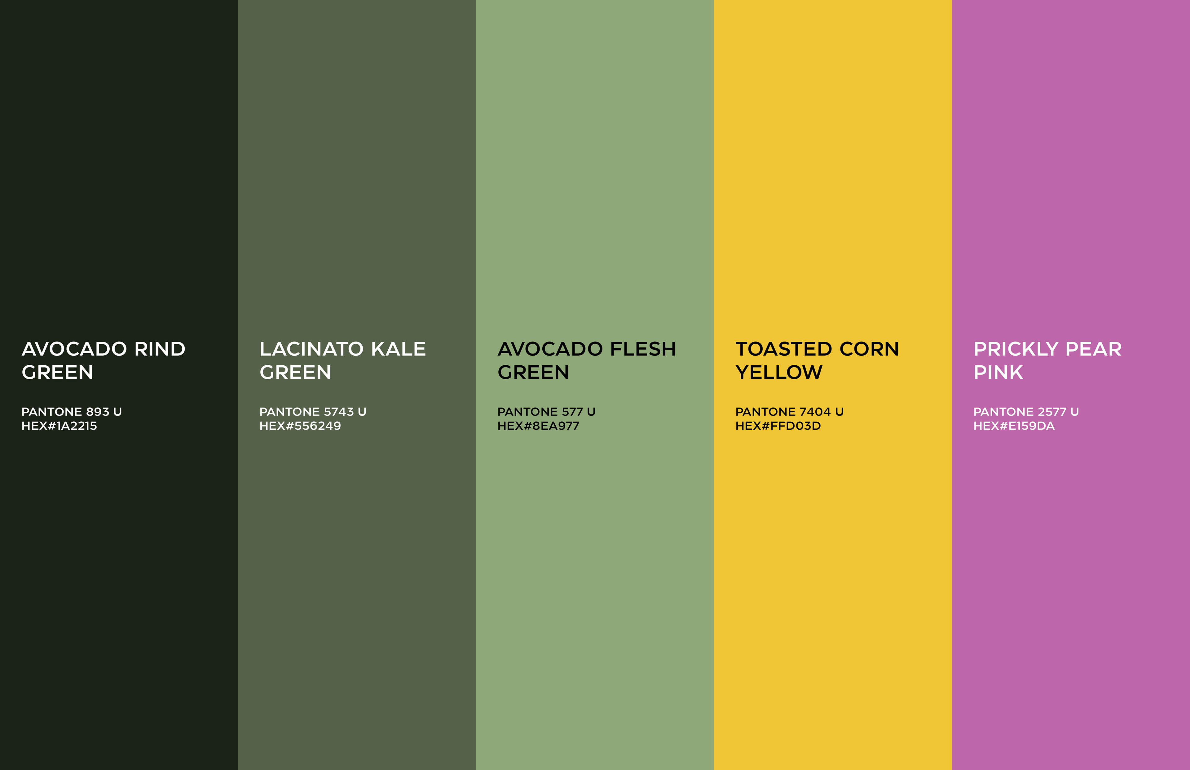
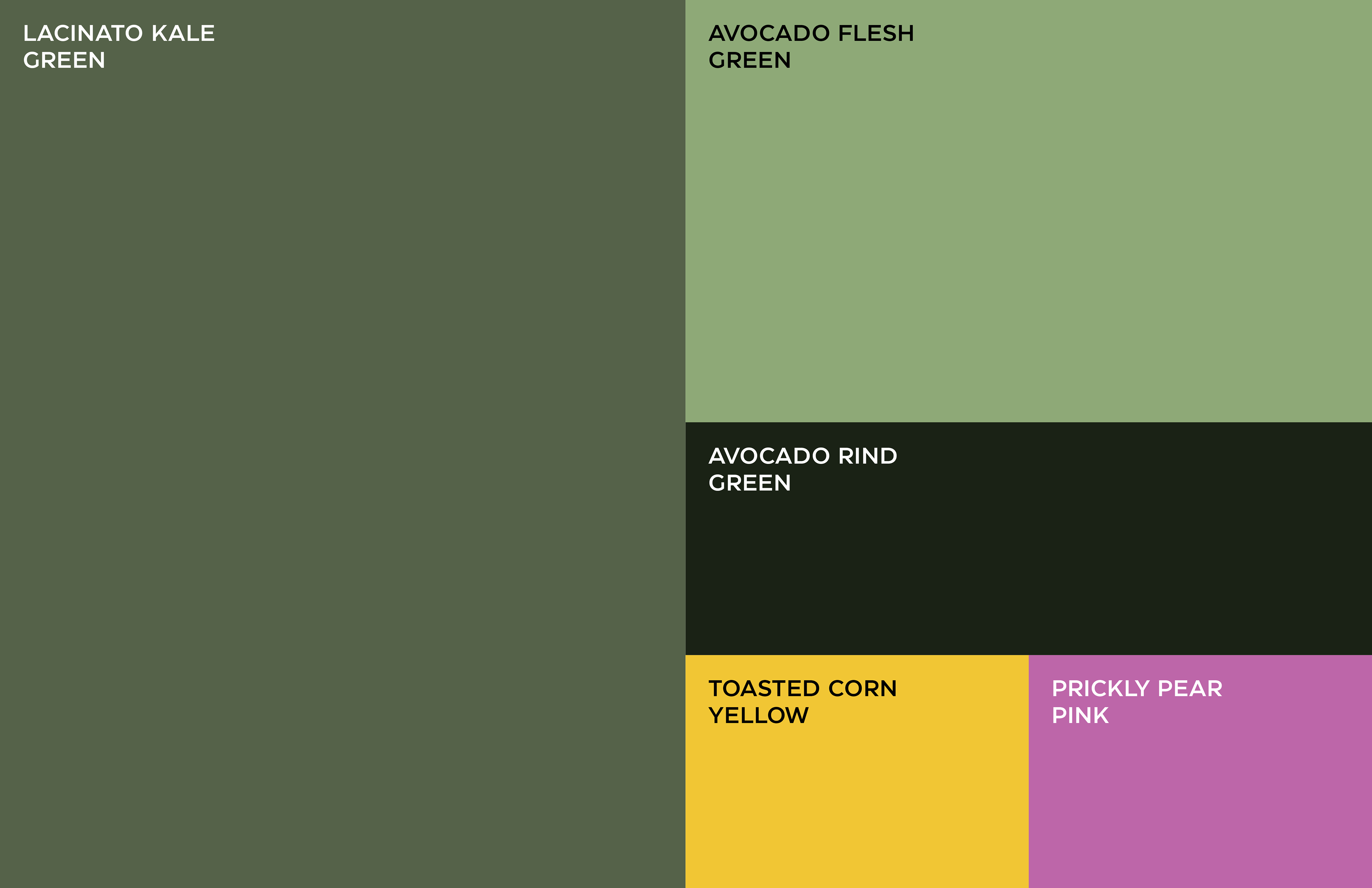
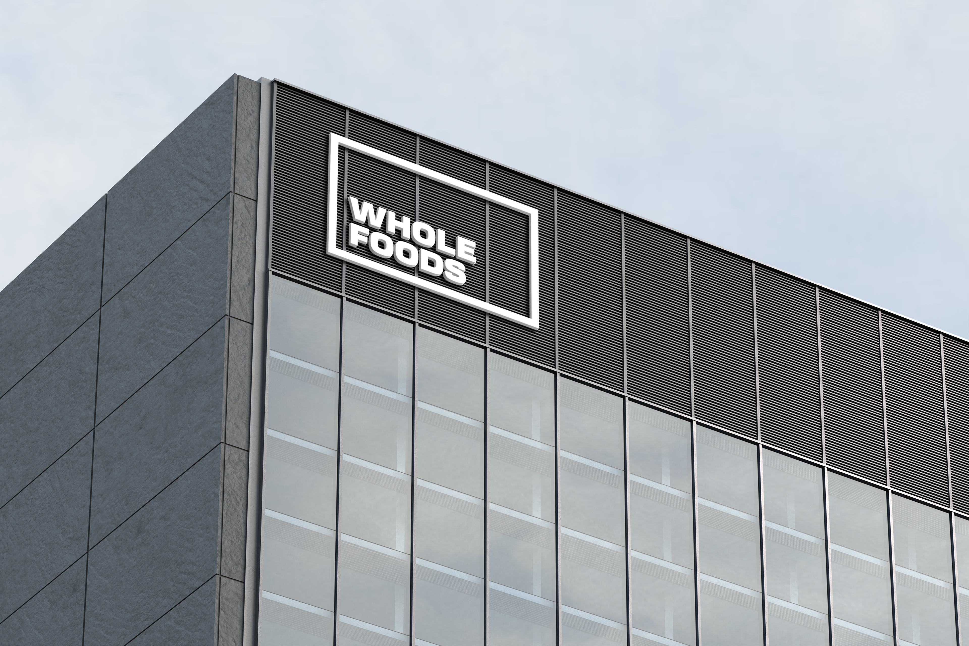
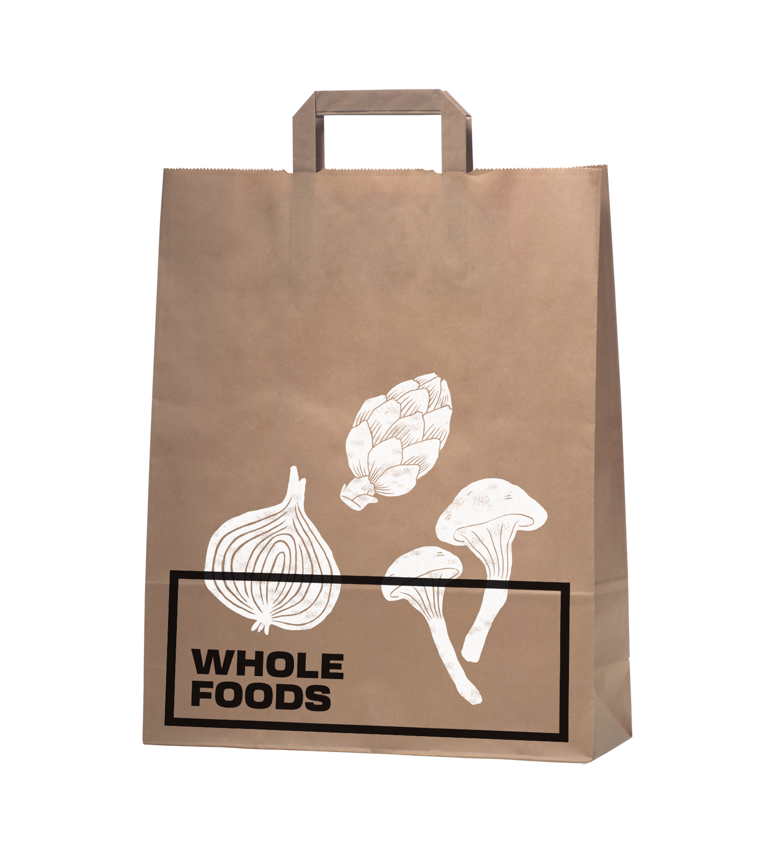
It is a rebranding of Whole Foods with a more contemporary, modern style. A new logo contains a variable system that now sets it apart with the ability to change, fill space, or frame elements. The frame element is meant to represent living through Whole Foods’ frame of values and also how it can change to fit your own values, as well as an abstract view of a shopping basket or cart from above. This new logo contrasted with hand-done illustration keeping a hearty, grounded, and rustic undertone.


Results
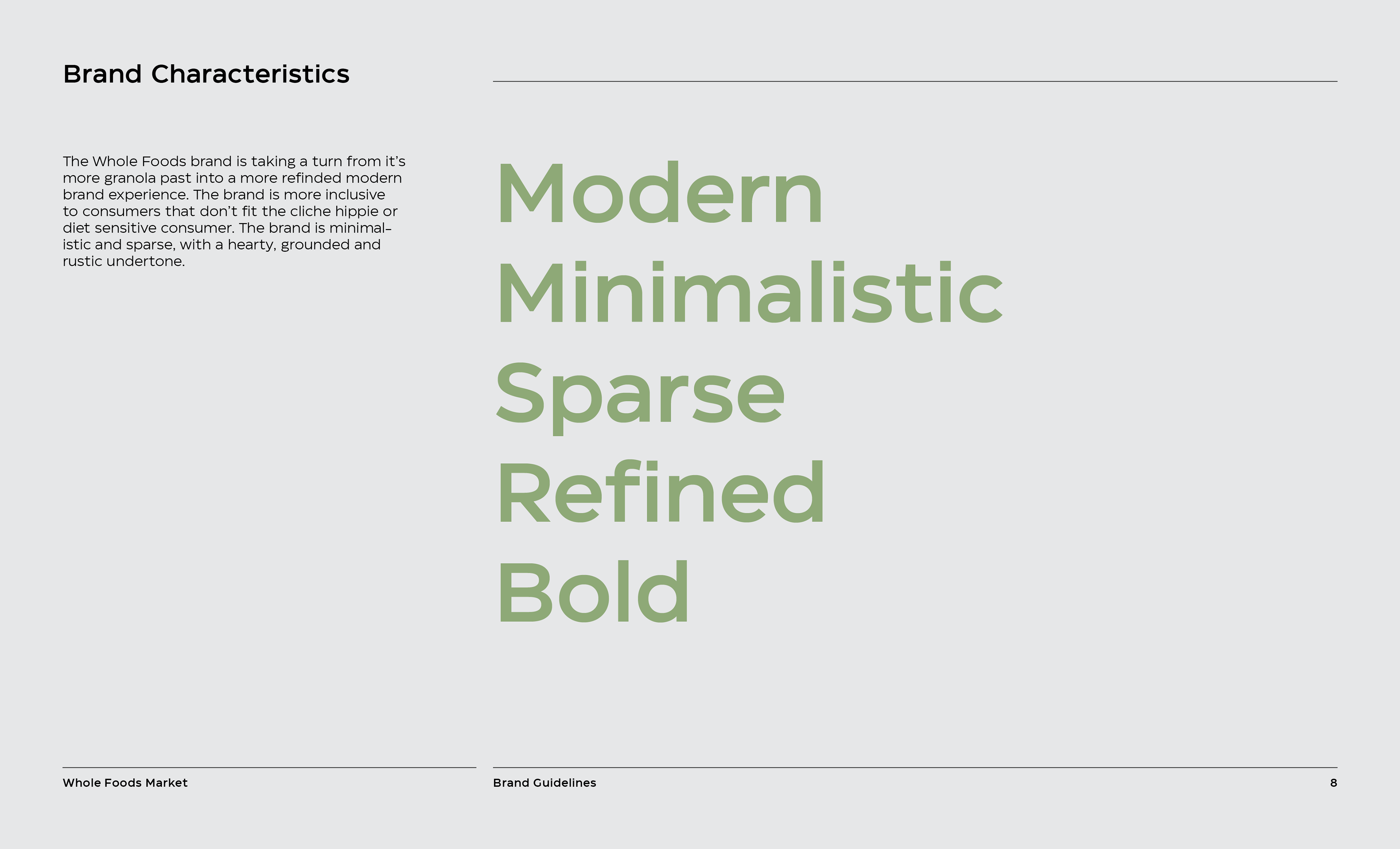
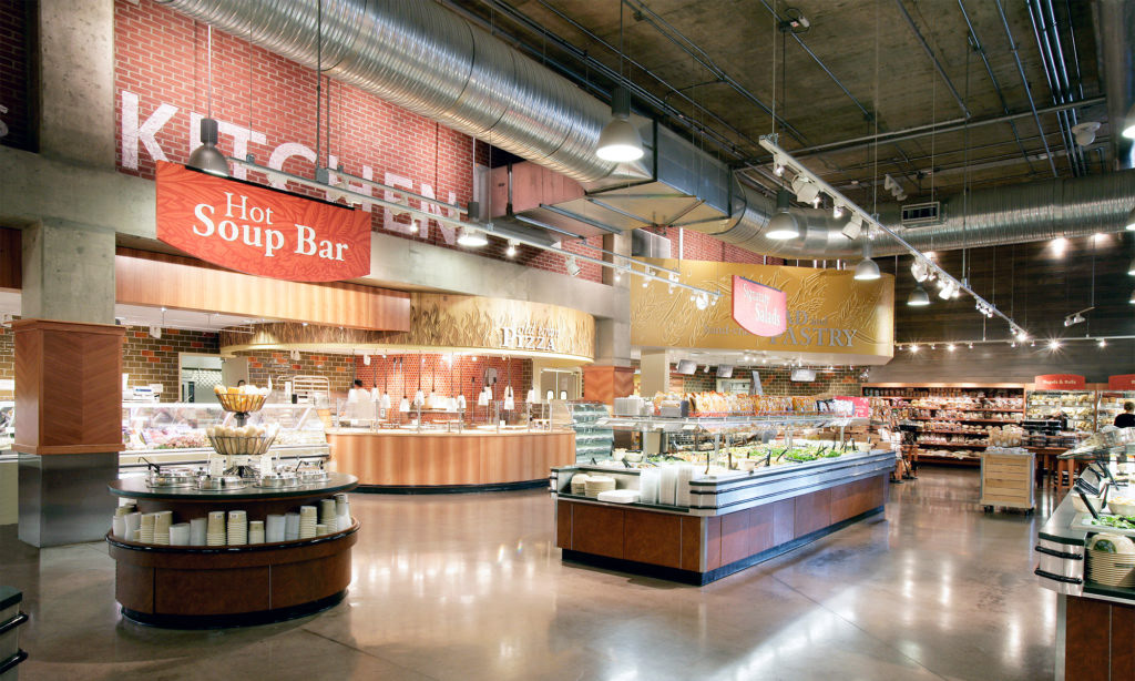
The Whole Foods brand is taking a turn from its more granola past into a more refined modern brand experience that more aligns with the in-store experience. The brand is more inclusive to consumers that don’t fit the holistic or diet-sensitive consumer while remaining open to the continued support of this loyal market segment.
Graphics Standard Manual